
ABC News Live’s new look channels tabs as reference to storytelling

Weekly insights on the technology, production and business decisions shaping media and broadcast. Free to access. Independent coverage. Unsubscribe anytime.
The premise of ABC News Live’s new graphics package spans both the old and the new through a familiar shape that, in turn, inspires other key motifs.
“We wanted to go outside, and I had worked with Michael on several projects prior to this. For me, there was no other choice,” said Hal Aronow-Theil, the executive creative director for ABC News, regarding Michael Vamosy, co-founder and chief creative officer of Vivid Zero.
Ultimately, ABC News Live needed a package that updated its brand while still remaining accessible to its editorial and design teams.
“Now that it’s put together, all my artists and producers know what we can and cannot do as far as getting graphics done quickly or, in other cases, grow from the look,” said Mike Moskowitz, senior art director at ABC News.

The chance to work with the same design studio that created the graphics package used by the network’s owned stations, “Good Morning America” and “The View” resulted in a signature graphic element: the notion of a “tab.”
Of course, a tab can mean different things depending on what era you’re in. It stands as a nod to the traditional paper file folders that once lined the walls of doctor’s offices, were packed into heavy metal drawers or lay stacked on a busy worker’s desk.
For later generations, it’s probably more closely linked with tabbed browsing and other user interfaces found in many apps.


In its most straightforward presentation, the package relies heavily on the tabs to help showcase branding, locales or categories of the news. The tabs themselves are shown with tightly rounded corners each time there’s a right angle.

“All of these stories fit into this endless world that we live in, but it’s brought to you and presented to you in such an organized method,” said Vamosy. “This logical method really helps embody the news and storytelling aspect of ABC News.”
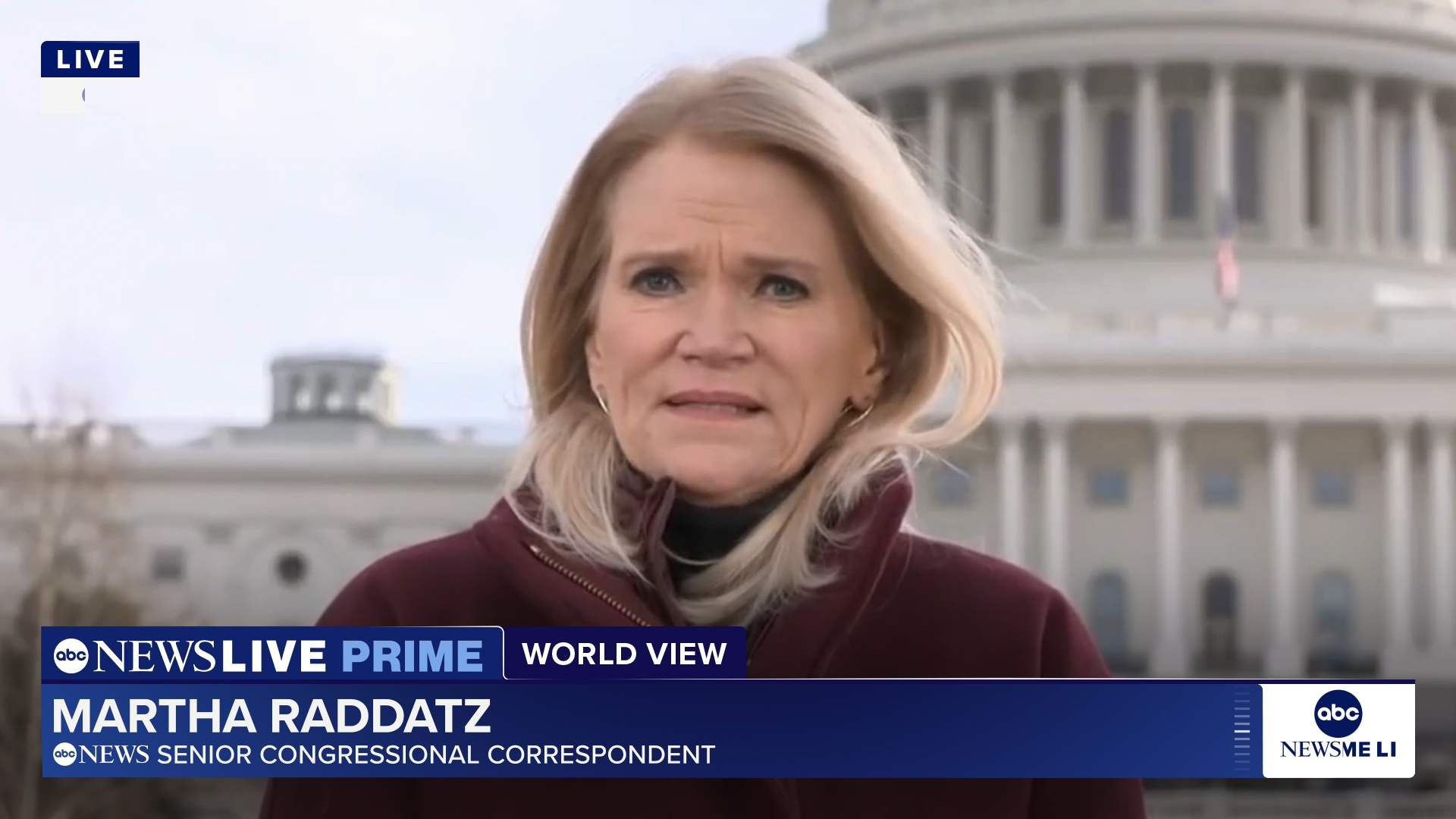
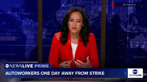
Tabs are also used in the redesigned lower third, which is a key part of the package.
“The lower third really become the workhorse of storytelling is really where we kind of put that structure back into place and make sure that it’s going to work for ABC,” said Vamosy.
Considerable collaboration went into the lower third design and how the bug, which sits in the lower right side of the screen, blends with the lower third. Together, these two elements are unique in that it’s the one graphic element that’s on the streaming screen nearly all the time.

“Testing a design theory and then making sure it looks great in an open but also the lower-third system and structure. This is how you can deliver more information to support the content,” said Vamosy. “If the lower third’s not working, then nothing’s gonna work,” he added.
In addition to the banner text shown in this space, which is now set in Proxima Nova, the tabs appear in the lower thirds to bring additional content and branding elements. In many cases, the tabs appear with effects that add depth, a common design tactic that uses concepts from material design to reinforce hierarchy and separate information.
What’s different about this approach, however, is that the tab shape is also featured elsewhere throughout the package, including in some imaginative ways.
In many of the fullscreen applications, the tabs are further interpreted as being part of a flat, glass-like panel that brings in a strong, solid base to the package. Vivid Zero then went all in with those panels, stretching them out in a repeating pattern that is also imagined as marching along inside the curved paths of the letters “ABC” in the network logo.
Thanks to the circular letterforms and base of the “dot” globe logo, the resulting image is a line of panels that look like dominoes, often depicted as following those circles.
The result ended up registering a bit of a surprise for the team.

“It almost feels like the old slide carousel,” explained Vamosy, noting that this was a common way his family gathered and shared memories.

That analogy carries through into what ABC News Live is all about — helping viewers see what’s happening in the world in an organized way that tells a story.
Once the tabs and circular form were nailed down, everything started to “click,” said Vamosy. “Once you figure that out, the package almost designs itself.”
All told, Moskowitz said he ended up with a spreadsheet with around 295 rows to serve as a sort of central depository of all the variations of layouts that editorial and technical teams could pick from.

Although, by design, the carousel arrangement of the panels is a standout visual, the design team also explored other ways to incorporate this theme into other parts of the design in addition to its use as a background element, including behind boxed elements and fullscreen quotes and bullet lists.
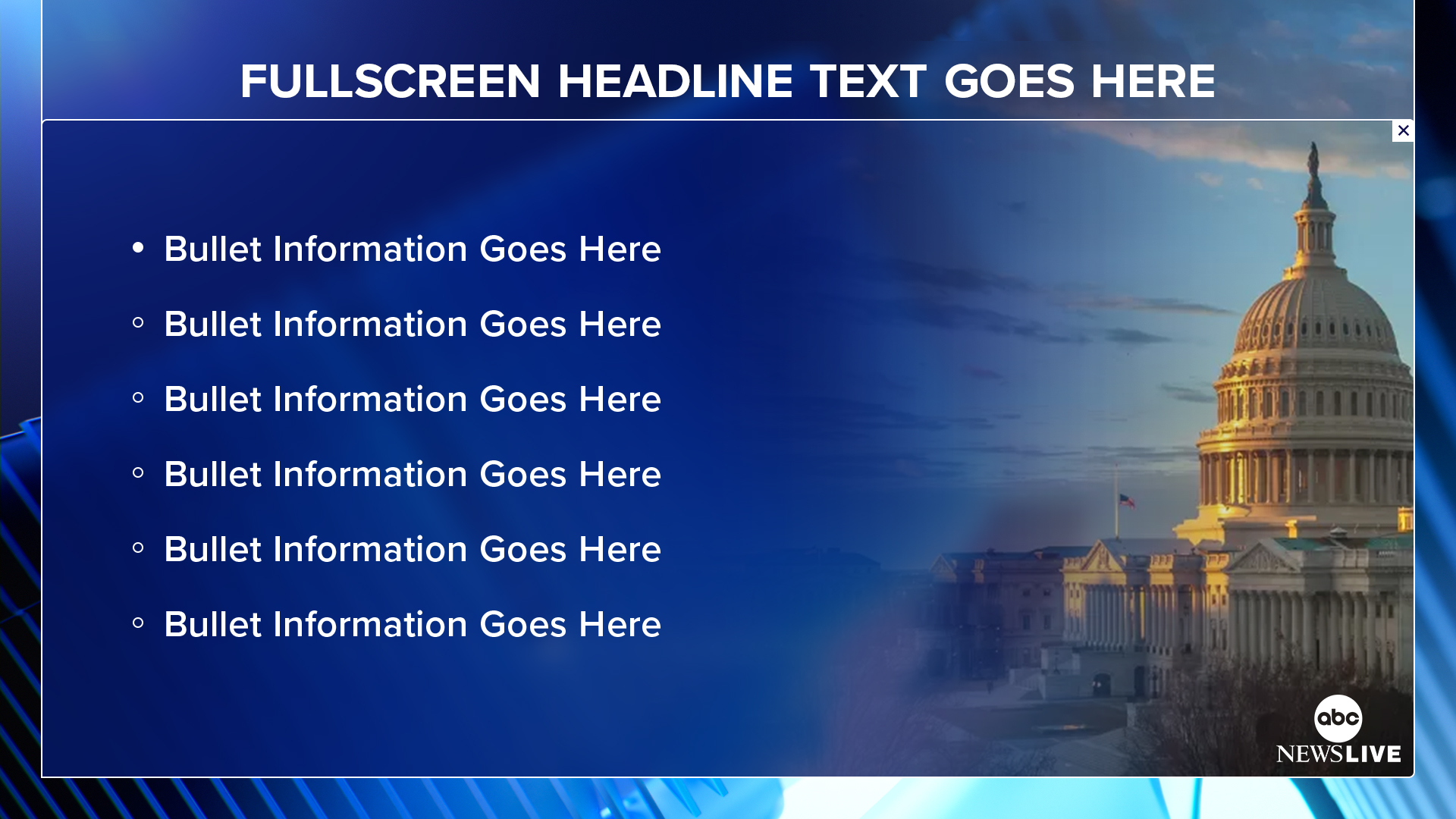
One approach was to use the tabs as if they are attached to large opaque panels that can pass over each other and other elements and, thanks to a bit of glass morphism, interact in subtle ways with the elements behind it, including another tabbed panel.
In these cases, the elements appear with the tab and panel in a very traditional view, basically mimicking how a file folder would appear when viewed with its largest flat surface directly facing the viewer.
A prominent example of this is the package’s use of this is in wipes during teases for upcoming stories, where the panels exit and enter for one side of the screen, one passes over the other and then each one exits on the opposite side.
In addition to this usage, the tab motif is used with a creative twist where it looks like the panels are arranged in a gentle curve, an element that appears elsewhere in the look, with each one overlaying parts of the one below it. This approach is often used with rotating animation pathways, solidifying the reference to curves and circles and neatly framing in the content in the center.
These curves then opened up the opportunity for Vivid Zero to incorporate circle-inspired elements in other places, including ring-like wipes, opens and bumpers. In many instances, the circular shapes incorporated into the background also have glassy effect that affects what is behind each one.
“The curve really relates to the touchability of an old school slide or those little folders that you would open up,” noted Vamosy.
Speaking of the curve, the team was especially happy when the network’s in-house designers spotted the subtle curved elements in the lower third and bug and saw the connection between that and the rest of the look.
Adding in the curve is also another way to pay homage to the network logo, as well as soften the look and make it feel more approachable.
The team also strategically integrated part of the ABC brand, including elements inspired by the animation created when the network as a whole started rolling out a new logo and brand back in 2021.
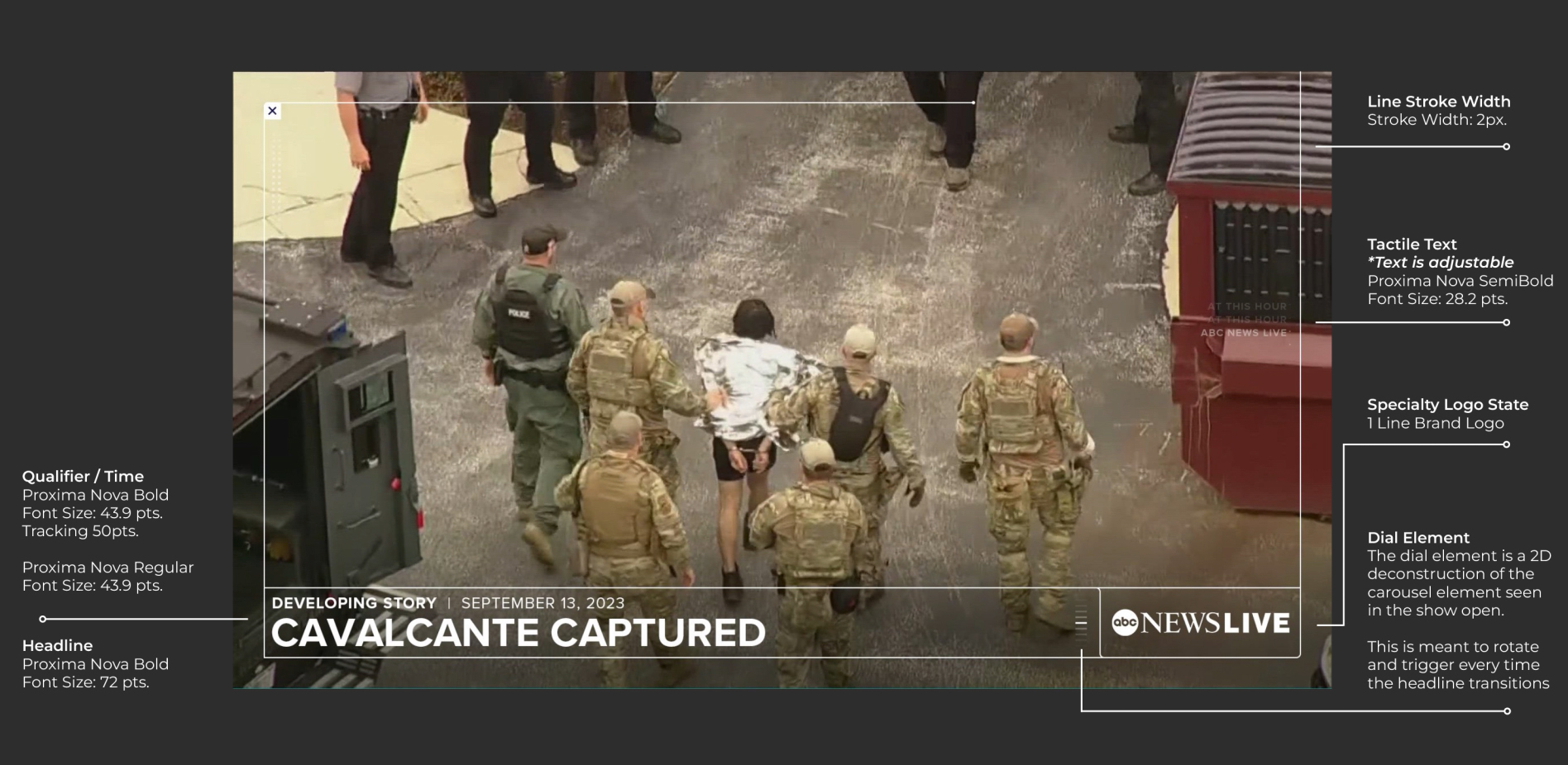
A guide to how the content opens are laid out in the new ABC News Live graphics package.
“It feels as if you could reach out and touch it, which helps bring that organic quality to this slick kind of digital forward-facing feel,” said Vamosy, referencing the numerous other elements in the package that feel very much like a user interface while still respecting the key themes of the design.
The dial element, for example, that serves as an endcap for banners, can also be seen as a nod to the series of panels. The design also includes elegant outlines in both straight and curved shapes, hashmark accents (again a reference to the panels) as well as close icons, all with coordinating animations. A simplified version of the carousel is also repurposed as a loading indicator.
Designers and animators also had a chance to stretch their muscles by creating a look that has an incredible level of detail, thanks to the fine resolution that most mobile devices now support.
The level of detail of the designs is hard not to miss. The Vivid Zero team paid close attention to how the screen would look on both mobile and larger devices. Each design was crafted under the notion that if it’s visible on mobile, it will play well on other screens.
Meanwhile, the clean, sharp edges of the glass panels add the solid foundation and reputation of ABC News to the ABC News Live. These elements, along with sharp outlines on the rows of tabs in the banners, also quite literally reinforce the idea of the streamer being a cutting-edge offering.
“Traditionally, you see more angular graphics, and it feels authoritative, but it feels like this has gravitas,” said Alex Ishida, creative director at Vivid Zero.
While adding those subtle curves is common throughout the package, there are still parts of the look that have a traditional right angle, including some views of the glass panels, a strategy that, especially when this is depicted as a sharp edge, also give the look that sense of authority and groundedness.
In fact, the very realistic looks of materials also ended up giving ABC News’ set designer Seth Easter a lot of jumping off points for creating the new sets installed inside the Disney building.
“There’s a lot of practicality in these elements — these glassine shapes — that lend themselves to certain practical materials,” said Gilbert Avila, executive creative director at Vivid Zero.
ABC News Live’s studio continues to be equipped with large swatches of seamless LED video walls, with Vivid Zero and ABC News cooperating on graphics such as backgrounds for the set. ABC also stayed in the family, utilizing Ross Video’s XPression Tessera to feed the video walls.
As part of the move, ABC News also created a new, more efficient Ross XPression installation with updated workflows that encourage collaboration and creativity. The revised workflows also eliminate the need for teams to send some of their work to one part of the system and others to a different one.
“We were always bolting on new technology and carving out from within to expand, and Disney had the great idea to put all of its brands under one piece of real estate. With that came a chance to upgrade our technology and our workflows,” said Aronow-Theil.
The switch to new graphics being driven by updated technology infrastructure also allowed the network to approach the streamer’s look from a broader perspective.
ABC News Live’s expansion over the years as it grew to meet the demands of streaming news coverage meant that the original look had been expanded, often quickly, as new programming launched, creating a need for more and more graphics.
“We realized we needed some overarching design and theme to pull it all together under one look and one umbrella,” said Aronow-Theil.
Aronow-Theil also noted that ABC News Live’s primetime programming had significantly refined its look, but this wasn’t always consistent across the entire day.
In this animation, both the lighter dayside look is shown juxtaposed with the deeper, richer ‘ABC News Live Prime’ look.
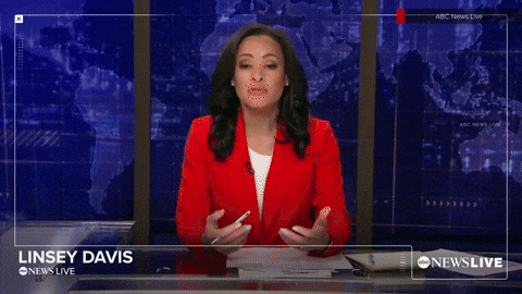
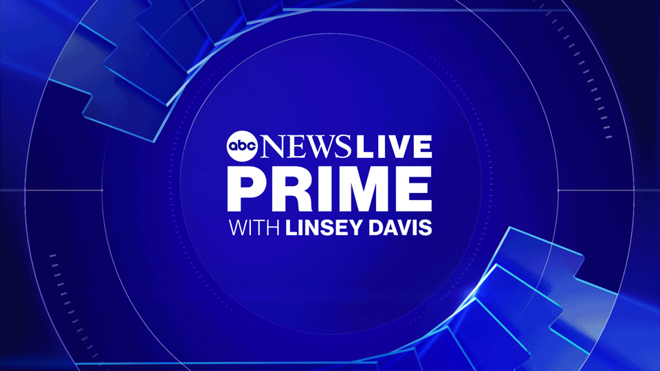
It was still important, however, for “ABC News Live Prime,” which is anchored by Linsey Davis, to stand out, so Vivid Zero picked richer, deeper blues to create a look of authority and sophistication. On the other hand, the dayside looks are meant to be more approachable while maintaining the same general look.

Red can also be brought in for breaking news and special reports.

The entire design process took much longer than it might take with, say, a show launch, which gave the team a lot of opportunities to refine the look.
New theme music for ABC News Live also debuted alongside the updates, composed by Matthew Kajcienski.
Despite all of the moving parts, Moskowitz noted that he’s never worked on a smoother project in his entire career, which is credited, in part, to having the time to thoughtfully approach the project.
This included significant trust between all teams involved, both inside ABC News and outside, including the point of the process where Moskowitz’s team was able to have the freedom to “do what we needed to do.”
The result, everyone concurred, was an extremely successful toolkit that not only elevated the look of ABC News Live to make it feel like a significant part of the entire division rather than just a “little sister.”
Like many broadcasters, ABC has clearly seen how significant streaming will be both now and into the future, and investing in this new, cohesive look was key to showing just how much ABC News Live has grown.
Project Credits
For ABC News
- Mike Moskowitz, senior art director
- Hal Aronow-Theil, executive creative director
For ABC News Live
- Lisa Overton, art director
- Kyle McKenzie, coordinating producer
For Vivid Zero
- Gilbert Avila, executive creator director
- Alex Ishida, creative director
- Diana Horowitz, graphic producer
- Jessie Nelson, animator
- Joe Lili, animator
- Michael Vamosy, co-founder and chief creative officer

tags
ABC, ABC News, ABC News Live, ABC News Live Prime, Alex Ishida, Diana Horowitz, Gilbert Avila, Hal Aronow-Theil, Jessie Nelson, Joe Lili, Kyle McKenzie, Linsey Davis, Lisa Overton, Matthew Kajcienski, Michael Vamosy, Mike Moskowitz, OTT, Proxima, Ross Video, Ross Xpression, Ross XPression Tessera, streaming, Vivid Zero, XPression
categories
Broadcast Design, Broadcast Industry News, Graphics, Heroes, Streaming, TV News Graphics Package