Golf Channel unveils updated logo design — and it will look familiar to many

Weekly insights on the technology, production and business decisions shaping media and broadcast. Free to access. Independent coverage. Unsubscribe anytime.
Golf Channel has unveiled its new logo — a look that draws heavily on its past brands.
The network, which is part of the bundle of networks being spun off from Comcast and NBCUniversal, had previously announced plans for a brand overhaul.
One of the main goals was to eliminate the use of the NBC peacock, much like the new branding introduced for the channel formerly known as MSNBC and CNBC, which are both part of the spinoff to Versant.

One version of the Golf Channel logo used from 2011 to 2014.
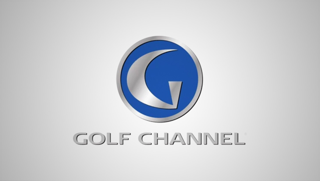
The updated logo essentially reverts to the logo icon it started using in 2011, which, in turn, was inspired by its original 2005 look. The “G” icon is then paired with the current Golf Channel workmark, which was introduced by NBC Sports Group in 2014.
The design features a circular golf-ball-shaped icon with a stylized “G” inside, drawn with a tee-shaped vertical element and a curved arc that suggests the swing of a club, the path of a golf ball or the contours of a golf course.
Sources tell NCS the new logo will roll out on January 1, 2026. Golf Channel and Versant Media did not respond to our request for comment.

The original Golf Channel logo (which included ‘The’) used from 2005 to 2011.
For the first few years of its existence, the network incorporated the article “The” into its name, which was set in an italicized version of Optima. Above this was the distinctive “G” shape, but it typically was shown by itself and not inside a circle.
This version also used a more muted shape of blue with green lettering, though the green would be largely dropped after 2011, with the shade of blue being bumped up a bit, likely in an effort to help it stand out more.
After switching to the updated version in 2011, the network used a variety of versions, including adjusting the 3D and bevel effects applied to it and occasionally shifting from blue to green.

A variation of the 2014 logo update that added the NBC peacock and switched to a custom-drawn wordmark.
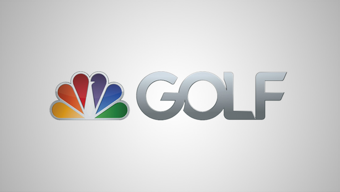
Before the 2025 update, Golf Channel had switched to completely different look in 2014. This version introduced the NBC peacock perched next to a custom-drawn “Golf” mark that featured distinctive tail-like notches and flared tips.

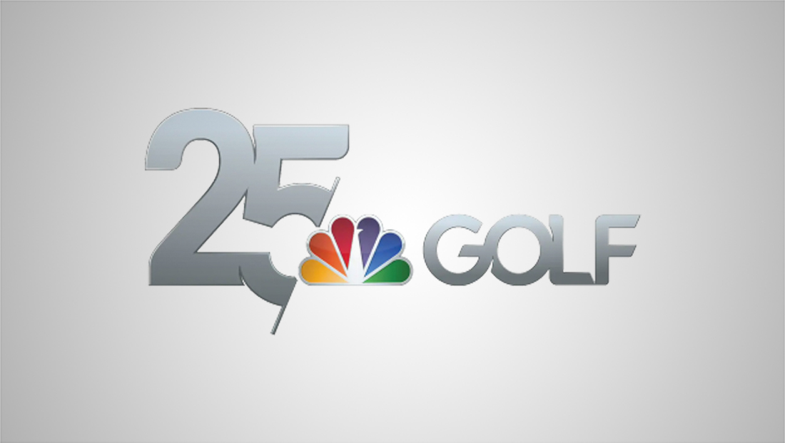
This logo went through a variety of styles, some with more or less 3D or gradient effects and was also used as part of a 25th anniversary lockup in 2020.
CNBC, another soon-to-be-former NBCUniversal property, also recently updated its logo. That update, however, could be more accurately described as a redesign, though it also incorporated a visual nod to its history in the design in the way the “N” and “B” interlink, a design note that was in its pre-NBC peacock look.


tags
comcast, Golf Channel, nbc peacock, NBCUniversal, Versant
categories
Branding, Broadcast Design, Broadcast Industry News, Cable Industry, Heroes, Sports Broadcasting & Production