Super Bowl LXI logo rides the waves to create solid, ‘gritty’ look

Weekly insights on the technology, production and business decisions shaping media and broadcast. Free to access. Independent coverage. Unsubscribe anytime.
The NFL has unveiled its logo design for the 2027 Super Bowl.
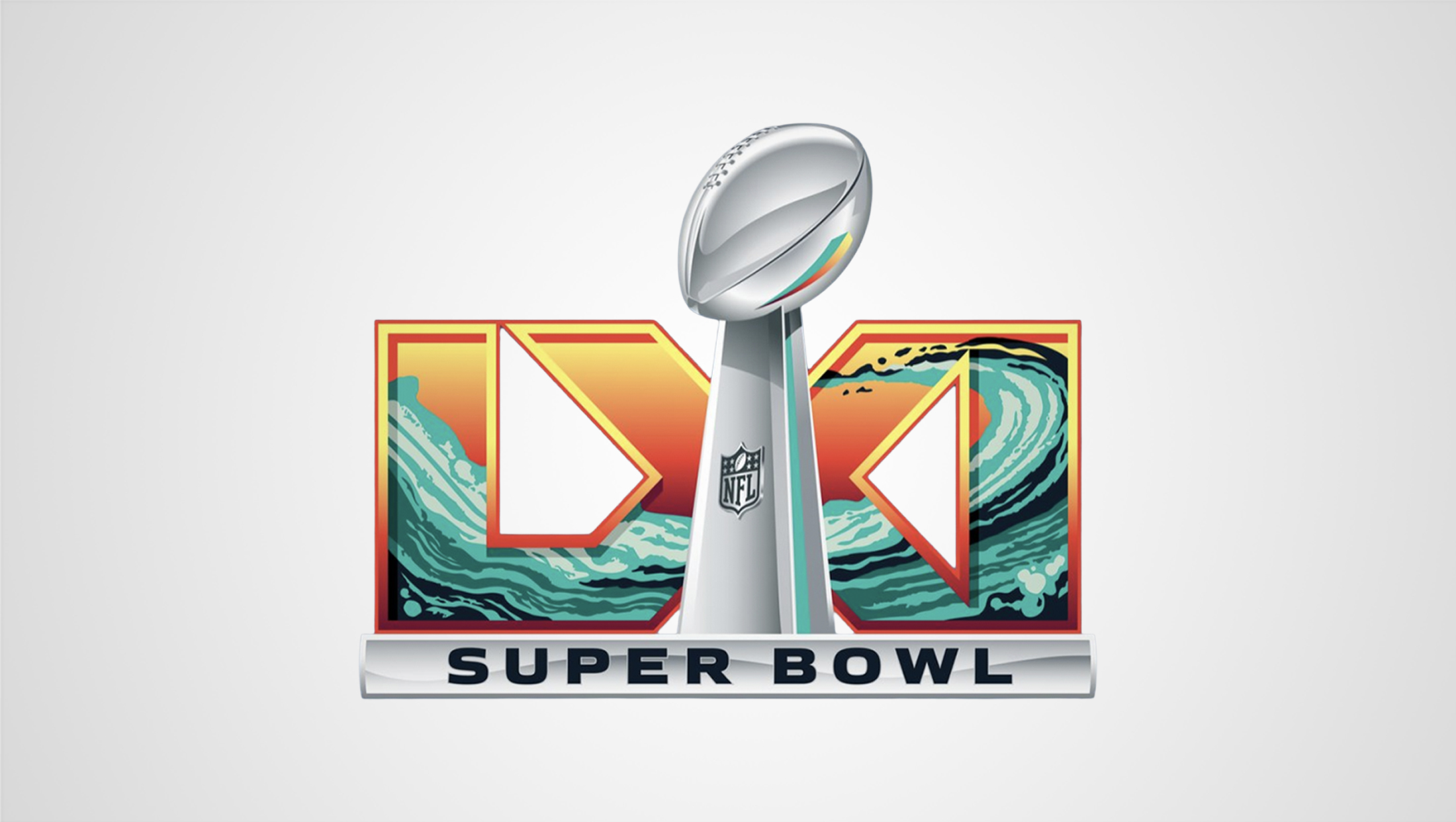
Officially branded as “Super Bowl LXI,” the logo largely follows the general principle of the last several years of logos with a 3D rendition of the Vince Lombardi Trophy in the middle, large, blocky Roman numerals behind and the word “Super Bowl” in a bar below.
For the 61st Super Bowl, the design uses a sunny orange to fill the Roman numerals while a teal and green wave icon sits inside, sweeping downward from the left before a quick trip back upward where it crests inside the “I” and upper right arm of the “X.”
The waves are in reference to the game’s location, the SoFi Stadium in Inglewood, California, just outside of Los Angeles, an area known for its oceanfront views and surf culture. It’s also worth noting that the distinct architecture of the stadium complex also happens to reflect a wave-like shape.
By including additional rough texture, the design is also meant to serve as a nod to the “grit and tenacity of Los Angeles,” according to the NFL.
With the trophy image hitting right in the middle of the “X,” the design appears to have widened that character a bit so that more of the shape is visible.
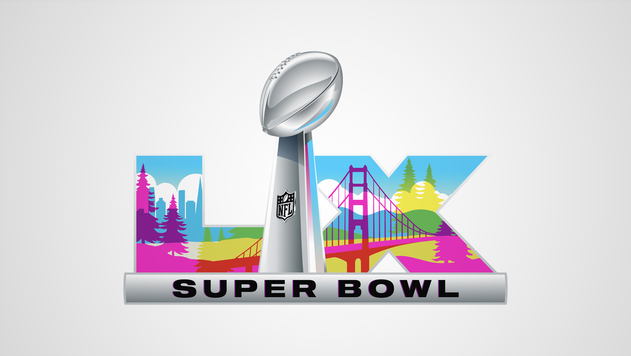
The LXI logo introduces some unique characteristics as well, including bringing back a more 3D bevel border around the letters that had been toned down for Super Bowl LX’s look (arguably, the 2026 Super Bowl logo’s numerals lost most hints of any 3D.
The illustration inside is also decidedly bolder than LX’s, with the shapes in the wave thicker, bolder and more textural than the largely flat San Francisco Bay Area imagery used then.

The color scheme, while certainly still bright, feels a bit tamer this time around and restricts the shades used to a narrow portion of the color wheel. That’s compared to the Super Bowl LX look, which used overlapping sections and transparency effects to create a wide variety of colors that also happened to feel more vibrant. LX appeared to use the base shades of cyan, magenta and yellow (part of the CMYK process printing base) that were combined to form more shades.
Finally, the LXI logo also connects each of the three letters, with the lower leg of the “L” merging with the lower left arm of the X and the lower right arm of that letter connected to the upright “I.”
This approach typically makes designs feel more solid and grounded, but also runs the risk of the letters being misread, depending on the exact combinations needed.
The three letters in “61” are have very familiar and distinct shapes, so this lockup appears to run less of a risk of misunderstanding.
The “X” is easy to see, though sharp eyes might be bothered by the widening that was done to ensure it peeks out behind either side of the trophy. The “I” is very easy to read.
The “L,” however, isn’t quite as clear, largely because the lower leg feels perhaps a bit too short. This isn’t to suggest that there is a super high risk of the logo being read as “IXI” (which isn’t even a valid Roman numeral) and there also isn’t a clearcut solution to this and still maintain the distinct way the ascender touches the upper left tip of the “X” arm.
A final interesting effect created by the typography is the two instances of negative space that create a pair of inward-pointing elements — with the left one being a bit of an oddball shape — that nevertheless still create a sort of visual indicator pointing toward the trophy.


tags
Branding, logo design, NFL, super bowl, Super Bowl LXI
categories
Branding, Heroes, Sports Broadcasting & Production