WGN goes flat, angular with new sports graphics
Subscribe to NCS for the latest news, project case studies and product announcements in broadcast technology, creative design and engineering delivered to your inbox.
WGN, Tribune’s independent station in Chicago that holds the rights to select Chicago Cubs and Chicago White Sox games, rolled out a new look for its sports graphics with the start of this year’s baseball season that combine a flat rectangular and hexagon shapes.
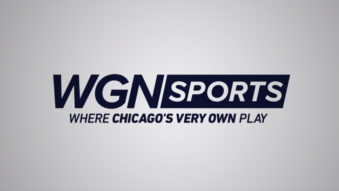
One of the most prominent aspects of the redesign includes a new logo for WGN Sports brand that utilizes the same font, Proxima, found in the redesigned logo and news graphics the station debuted in May 2017.
For the sports branding, WGN opted to italicize the type, giving it the sense of motion. Next to the station’s iconic call letters is an angled box that houses the word “sports.” —
Below this, the “Where Chicago’s very own play” tagline, which is a reference to the station’s main “Chicago’s very own” slogan, appears in Din, the other typeface also utilized in the news graphics package.
Subscribe to NCS for the latest news, project case studies and product announcements in broadcast technology, creative design and engineering delivered to your inbox.

tags
Baseball, Chicago, Chicago Cubs, Chicago White Sox, MLB, sports broadcast design, sports graphics, WGN, WGN Sports
categories
Broadcast Design, Graphics, Heroes, Sports Broadcasting & Production