
‘Primetime Justice’ debuts with uninspired graphic look
Subscribe to NCS for the latest news, project case studies and product announcements in broadcast technology, creative design and engineering delivered to your inbox.
HLN’s replacement for “Nancy Grace,” “Primetime Justice” debuted Monday evening with an interesting and rather uninspired mix of design elements.
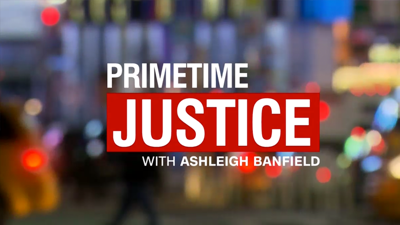
Despite using orange and golds and a softer overall look and feel in its promo featuring host Ashleigh Banfield, the show’s actual title card features a bold red hue mixed with a color palette of blue, oranges and violets.
The title card does include some of the bokeh-like effects seen in the promo spots.
The show’s opening sequence uses a somewhat odd mix of clips, including shots taken from the promo shoot featuring Banfield shot with a softer filter, as well as colorized legal themed imagery.

The open also includes the show’s name set in a thick red bar in lighter, italic version of CNN Sans.
During the show, the teases used for upcoming stories have a city-look, using light trails and motion blurs with large billboards and buildings.


For a set, the show uses CNN’s recently updated Studio 58 in New York City, with new lighting design by The Lighting Design Group and two large LED video walls added.

One of these walls is moved in front of the opening to the newsroom, essentially created an enclosed studio space. An additional video wall sits camera right, with the existing one appearing between the two.

The show makes use of the space’s newly changed anchor desk, with Banfield seated at one of the oval shaped overhangs and her studio guests seated to her right. For teases, the desk is also reconfigured to serve as a sort of lectern for Banfield to lean against.
During the show, the video panels are fed a colorized New York City skyline graphic accented with splashes of oranges and greens. Interestingly, the backdrop is void of any legal imagery like the ones seen in the intro.
The color scheme of the background is a bit reminiscent of the “CNN Tonight” graphics package and set — though the two looks are different stylistically.
For graphics, the show carried through the bold red color in its simple, boxy lower thirds that appear in white, black and blue as well.
The lower thirds are very similar to HLN’s old look — and the color scheme is very similar to parent network CNN’s.
The graphics package also features unique two and three box designs.
In the two-box layout, Banfield appears on the right side of the screen, slightly larger, with the guest on the left and slightly lowered beneath the show’s logo.


In the three box setup, Banfield moves to the center — again slightly larger — with the two guests flanking her. For some reason, this version of the graphic doesn’t include the thin white lines to break up the spots, making the shots bleed into each other in odd ways.

Overall it’s interesting that HLN didn’t opt to use a more unique look, such as the one from the shows promos, to help make the show stand out a better from the clutter of blue and red cityscape style graphics that abound both broadcast and cable news.
The choice to use non-legal imagery that’s also New York City centric is also interesting given that the show’s focus is legal injustices.
Subscribe to NCS for the latest news, project case studies and product announcements in broadcast technology, creative design and engineering delivered to your inbox.

tags
Ashleigh Banfield, CNN, HLN, nancy grace, Primetime Justice, The Lighting Design Group
categories
Cable News, Graphics, Heroes, News Set Design, Set Design, TV News Graphics Package, TV News Motion Graphics Design