Sky News updates logo

Weekly insights on the technology, production and business decisions shaping media and broadcast. Free to access. Independent coverage. Unsubscribe anytime.
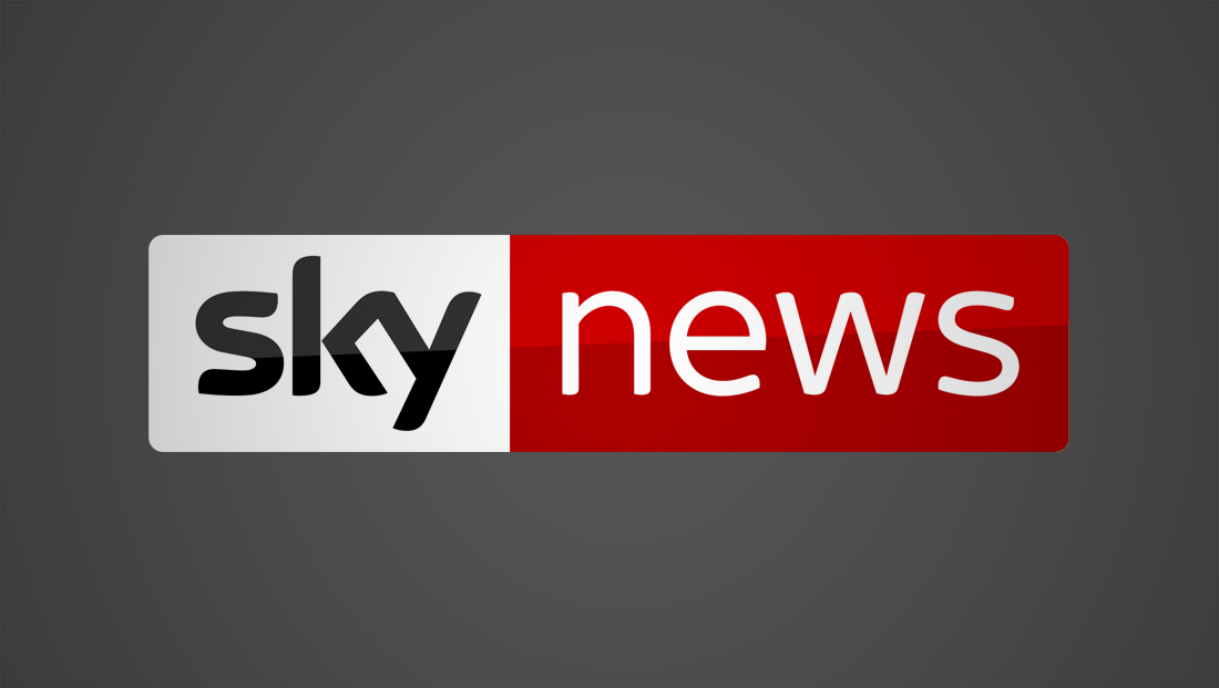
British broadcaster Sky News has rolled out an updated logo design.
The new design retains the distinctive “Sky” logotype on the left side of the logo, as well as the white and red containers.
The most significant change is that the new logo design drops the all caps rendition of the word “news.”

In the previous logo design, the word “news” was in a font crafted to echo the curves and shapes in the “Sky” logotype — and the new typography retains that feel but with lighter, more elegant strokes.
While the white and red containers, as well as the “Sky” logo retain a subtle reflection, it is much more subtle than the previous look.
Other changes include more careful attention to the spacing and margins in the logo design, changes that add to the more refined, elegant feel.
The new logo has been replaced in the network’s graphics package, which remains mostly the same as the flatter look introduced in May 2015.


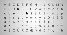
In some ways, the new, lighter typography is similar to the new typography fellow U.K. broadcaster BBC uses — BBC Reith.


tags
logo design, Sky News
categories
Branding, Broadcast Design, Broadcast Industry News, Graphics, Heroes, Networks