
Eurosport creates bold look packed with color for PyeongChang coverage
Weekly insights on the technology, production and business decisions shaping media and broadcast. Free to access. Independent coverage. Unsubscribe anytime.
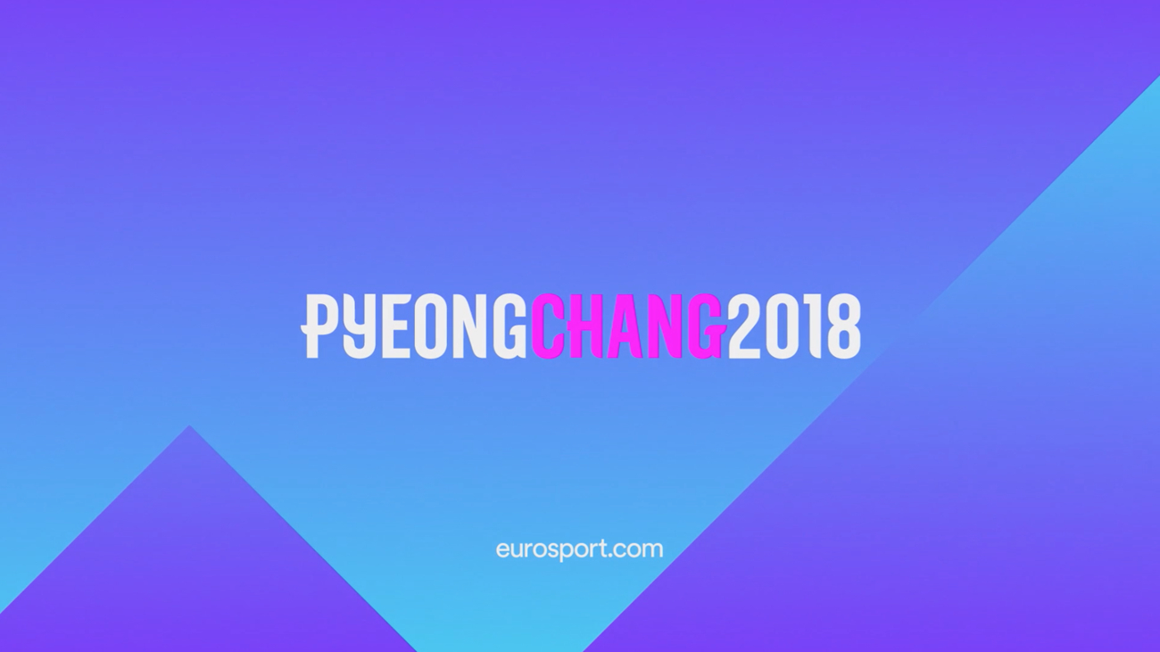
Bold from the start
Relying on bright hues of purple, blue and yellow, along with a bespoke typeface, Eurosport’s on-air design immediately separates itself from others, with an in-your-face style and even a Queen cover song for the theme music.
The look unabashedly shrugs off the usual design language of winter sports, shying away from blues and glassy ice-like elements.


This direction, however, was not a new one for the network, which relaunched in 2015 with a complete brand retooling built around the idea of “fueling your passion.” As part of the change, a brighter palette and bolder typographic treatment were introduced along with a new logo.
At the Olympics, specifically, this unconventional approach extended beyond just the graphics, into unique initiatives like a mobile studio and the network’s “Cube” augmented reality set at the IBC, which was made possible with technology from Vizrt and stYpe with graphics from DixonBaxi.
For the network’s opening titles, also from London agency DixonBaxi, phosphorescent light particles were used in neon tones with athletes representing various winter sports.
Eurosport’s efforts at the 2018 Winter Olympics stood out both technologically and graphically with many fans taking note and already praising the coverage, excited for what’s ahead in Tokyo.


tags
2018 Winter Olympics, discovery communications, DixonBaxi, eurosport, PyeongChang Olympics, PyeongChang Winter Olympics, sports broadcast design, sports motion graphics
categories
Branding, Broadcast Design, Featured, Graphics, Olympics, Sports Broadcasting & Production