
Combined Viacom, CBS to use camel case name
Subscribe to NCS for the latest news, project case studies and product announcements in broadcast technology, creative design and engineering delivered to your inbox.
CBS and Viacom have agreed to become one again — and have settled on the camel case name ViacomCBS.
The use of camel case is similar to the way AT&T formats the name it uses for most of Time Warner’s assets after it acquired the company — WarnerMedia.
Camel case is a design and typography term that refers to using capital letters for separated words but not separately them with punctuation or spaces and gets its name thanks to how the capital letters form “humps” — just like a camel’s back.
CBS, Viacom agree to $30 billion merger https://t.co/ARoZcj61qt #TVNews #BroadcastNews
— TVNewsMix (@TVNewsMix) August 13, 2019
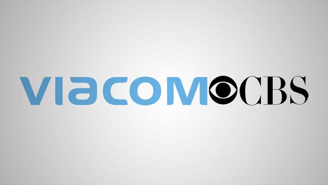
The company hasn’t released an updated logo design yet — so the graphical representation above is just a merging of the two company’s logos side-by-side.
The ordering is interesting given that CBS is technically acquiring Viacom.

CBS’s value has more than doubled since it was last linked to Viacom.
It’s also worth noting how Viacom’s name is placed first when it arguably isn’t as recognizable, at least among those outside the media biz, but the corporate banner may not be intended to become a truly public facing brand.
Think of it this way — industry watchers know the name WarnerMedia but it’s not necessarily something the typical consumer would see often other than, perhaps, copyright lines or show credits.
All that said, putting the CBS name first would have resulted in “CBSViacom” which is a bit hard on the eyes — and to read.
With ViacomCBS becoming second large media merger getting a camel case name, this could be the start of a branding trend.
For a while, the media industry went under a mini-trend of forming odd new words that were (kind of) acronyms or anagrams for names.
Tegna, the TV division of Gannett created as the result of a 2015 spinoff, was one of the early examples (even though Tegna was technically the “old” Gannett while the “new” Gannett, which kept the old name, was a new entity).

Another example, Tribune’s Tronc, lasted two years before the company ended up going back to the more traditional Tribune Publishing name.
Subscribe to NCS for the latest news, project case studies and product announcements in broadcast technology, creative design and engineering delivered to your inbox.

tags
CBS, gannett, logo design, Tegna, Tronc, Viacom, ViacomCBS
categories
Branding, Broadcast Industry News, Featured