
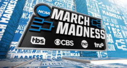
March Madness broadcast design builds on hype, vibrancy of teams

Weekly insights on the technology, production and business decisions shaping media and broadcast. Free to access. Independent coverage. Unsubscribe anytime.
As this year’s March Madness tipped off in Indianapolis it was with a new broadcast design package two years in the making.
Created through a collaboration between CBS Sports, Turner Sports and Drive Studio, the look was slated to debut in 2020, however, the annual NCAA Tournament was canceled only days before it was scheduled to begin.
“The paint was drying on this package when COVID-19 hit. I think literally the last element that we were working on was the open,” said Jordan Shorthouse, creative director at Turner Sports. “It was such an awkward feeling to be that busy and also that excited to see something hit screen, and then it’s pulled from under you.”
The process of creating the new look, however, actually started in spring 2019 as the team at CBS and Turner began reviewing pitches for the redesign.
“We opened up the first deck and the very first pitch was titled ‘Shout’ with an exclamation point and I think that embodied everything we were looking for,” said JP LoMonaco, vice president of on-air graphics & design at CBS Sports. “We were looking to up the energy level of the graphics package.”
“The previous package was a little dark. We had based it in this industrial training facility for the NCAA with concrete walls… but, the nature of the tournament is frenzy and excitement,” said LoMonaco.
The winning pitch, from Drive Studio, combines energy, frenzy and pops of color. Drive notes the look is loud, inspired by the fans, approachable and familiar with plenty of room longevity.

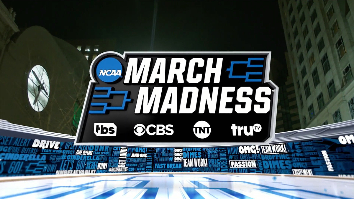
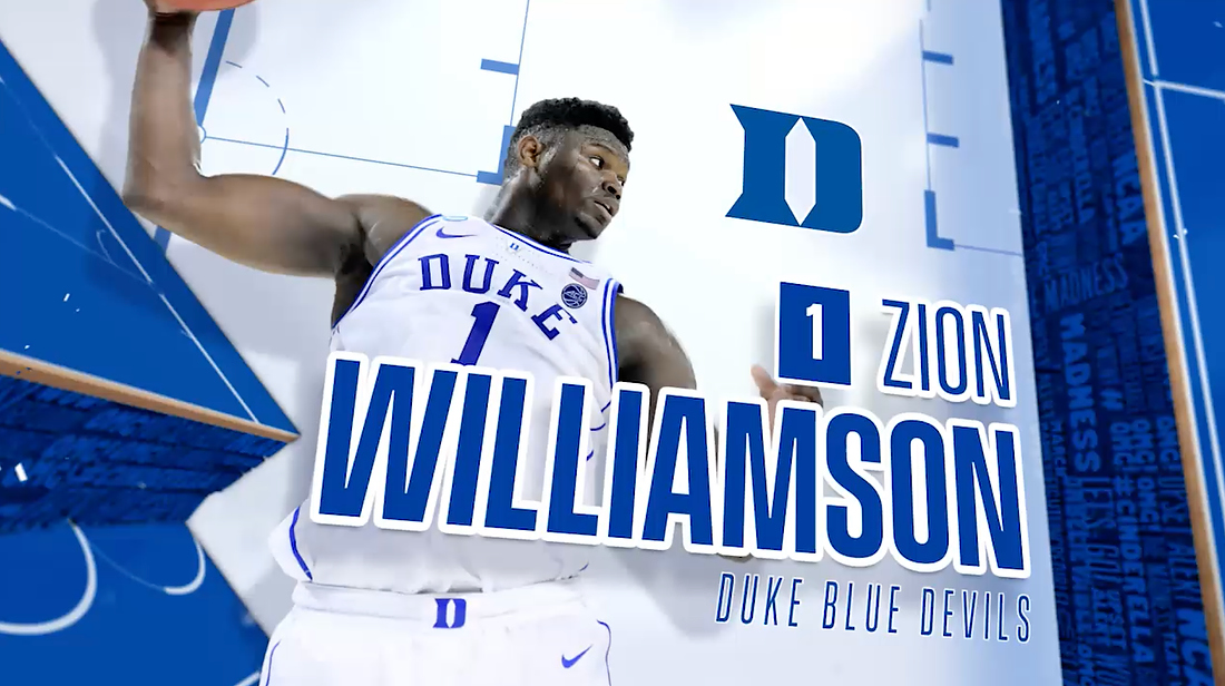
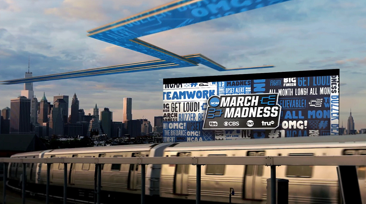
The Hype Wall
The hallmark of the design is built around a tag cloud known internally as the “Hype Wall” which includes some key phrases associated with the tournament.
These words are then paired with illustrated iconography to capture the posters often brought by fans to college basketball games.
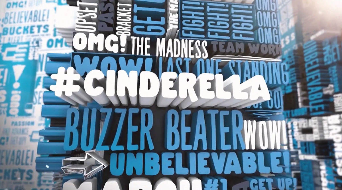
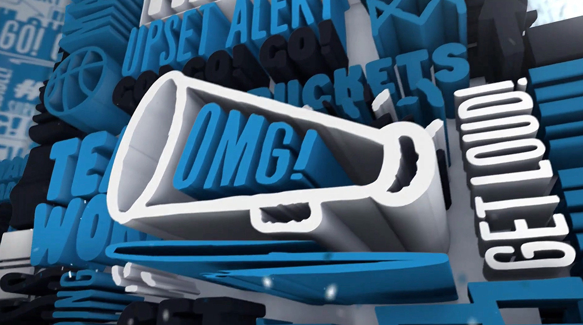
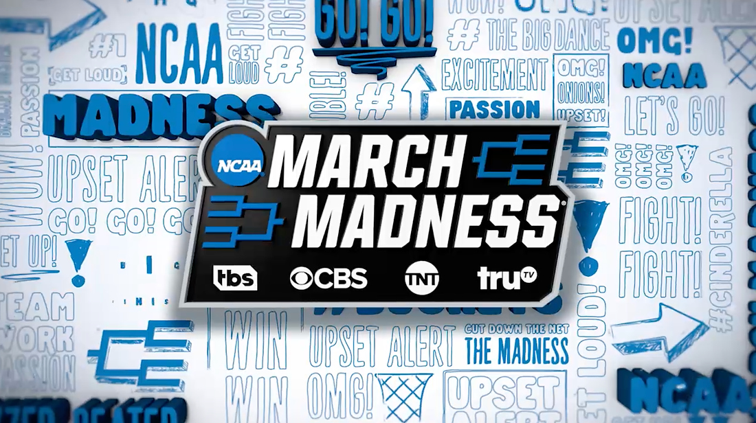
“We wanted this sense that the Hype Wall is sort of four-sided, it’s got other dimensions to it. It’s not just flat, painted on a wall, it’s a living thing. And, if you look closely at the package, there are multiple versions of the Hype Wall,” said LoMonaco. “There are moments when it feels like a glued poster on a street wall. Or it feels like something fully graphic and alive, moving in 3D.”
LoMonaco notes the team went through hundreds of words to find the right combination, phrases like “big dance,” “buzzer beater,” “unbelievable” and “upset alert.”
“Words obviously dial in a very specific tie to things,” said LoMonaco. “So you have to tread lightly there and you have to be careful. But there was a thorough process with everybody involved.”
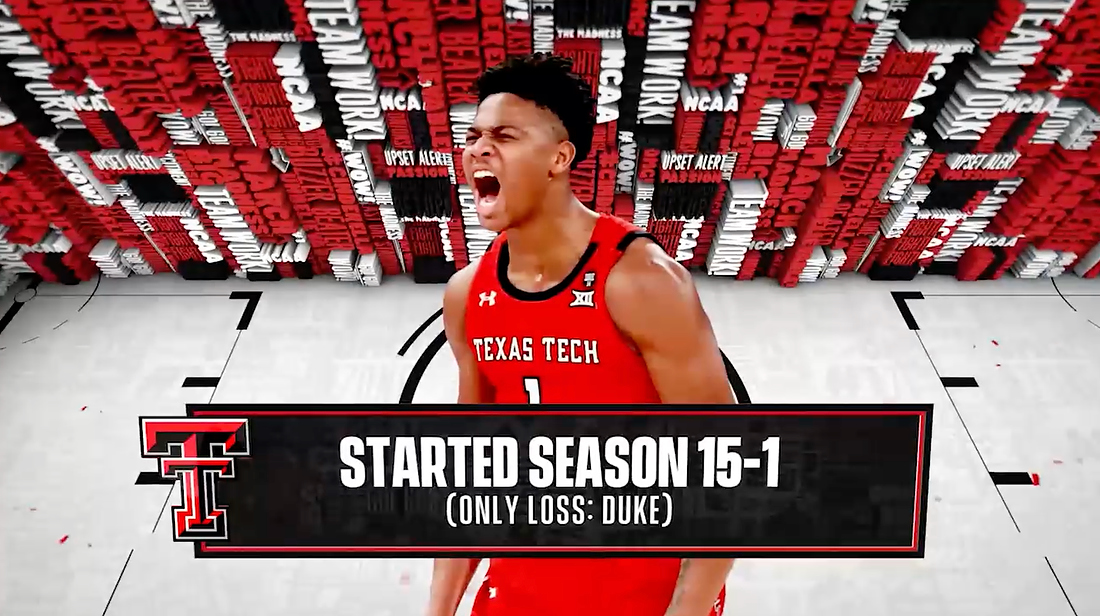
The fan’s voice was also pulled into the package through the use of color, which was lacking from the previous package.
“When you’re at the event, in the arena, it’s just a wash of color and it’s so vibrant,” said Shorthouse. “Making this leap was even that much more significant [over the previous design] and it feels that much more improved… I think through color, obviously, through emotion, it’s got a frenziness about it and that matches the fans and also the game itself.”
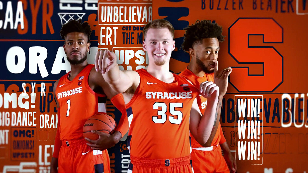
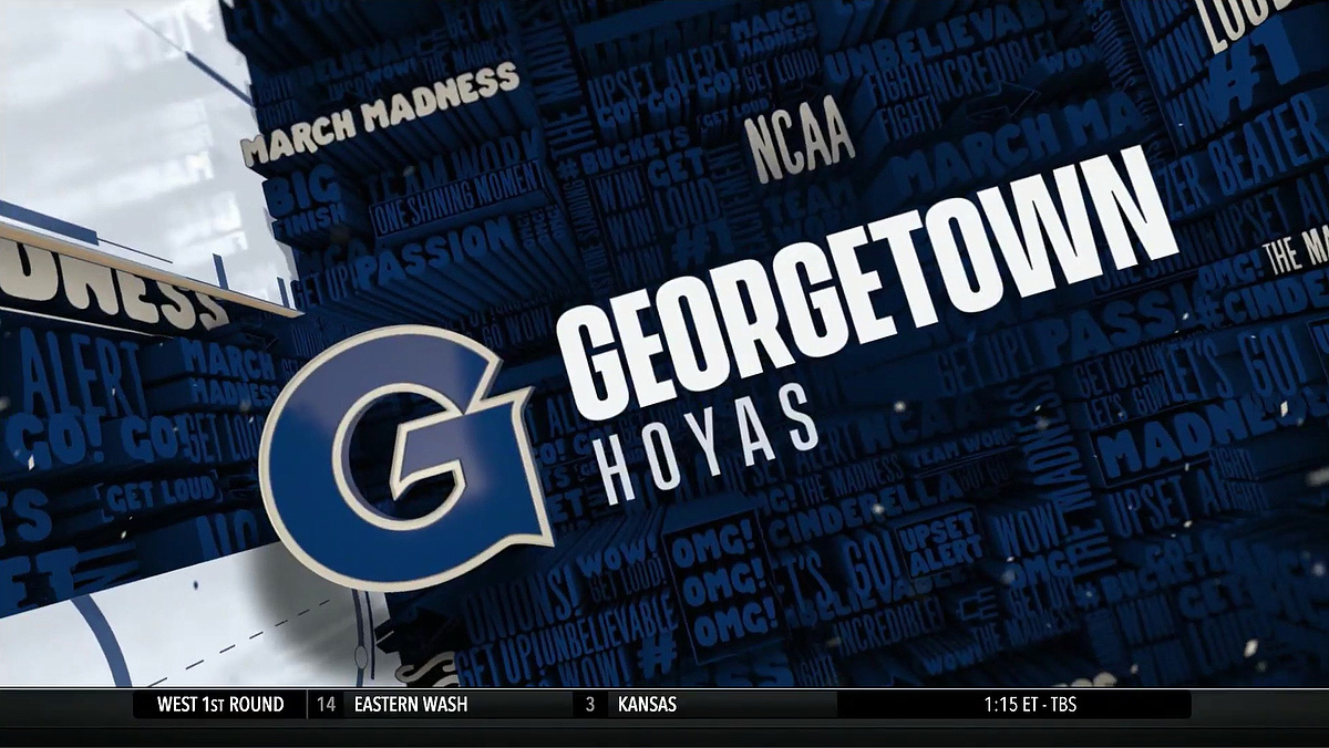

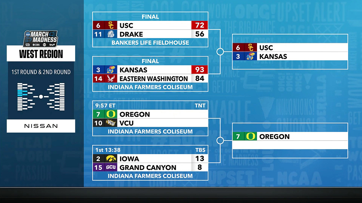
Along with taking on team colors during interstitials, the use of color will become more apparent as the tournament bracket shrinks with the Hype Wall words changing hues to match the remaining teams.
“It’s very customizable. It personalizes a lot of what we put on the screen,” said LoMonaco.
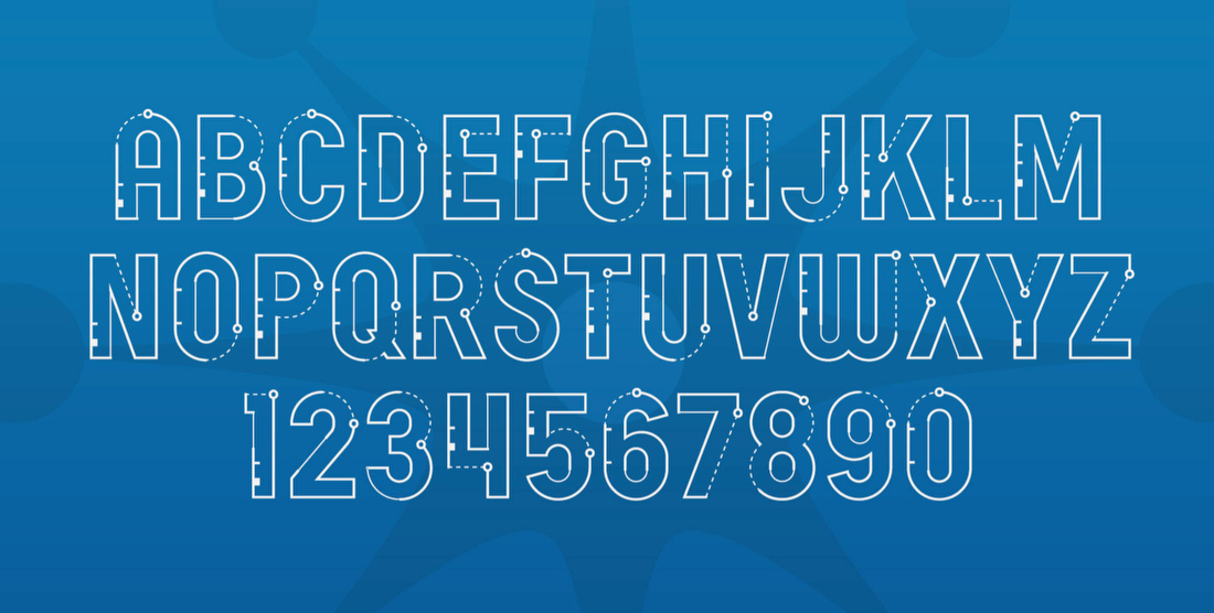
Font-wise, the look is built around Avenir, which is used for most of the data-heavy elements and Vanguard with Be Bold for the Hype Wall.
Drive Studios also developed a custom typeface called Drive Court Sans for larger display usage, drawing inspiration from the lines of a basketball court.
Coming together for the tournament
The main open for the tournament includes footage from across the United States with an imposing bracket entering the scenes.

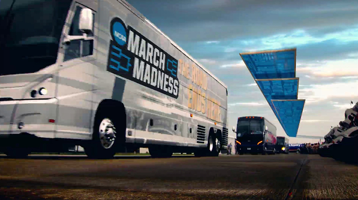
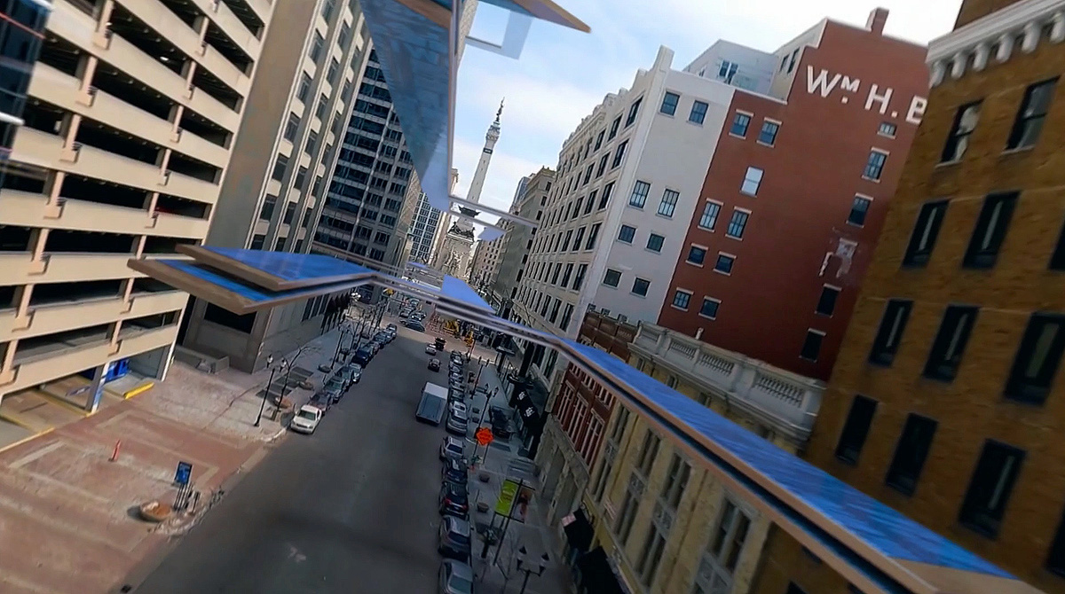
“We wanted to tell the story of teams coming from across the country, various locations, various schools traveling across the country, to arrive at the host city for the championship,” said Shorthouse.
“You’ll see those ribbons fly across different landscape scenes, whether it’s a small town in middle USA or New York City,” said Shorthouse. “The idea was to make sure that we captured these different regions throughout the country… and then eventually they all come together to build the end-page in the host city.”
The open was originally filmed for last year’s host city, Atlanta, and was then updated with new drone visuals for this year’s, Indianapolis.
Key moments from the original version of the open were also updated to reflect limited arena capacities and mask mandates. Shorthouse noted it was a tough call on whether to include maskless fans from in the open, but in the end, “it just didn’t feel right. So we had to come up with an alternative for those moments.”
“Hopefully next year, we’ll be able to plug those back in,” said Shorthouse.
“All these little ingredients, the Hype Wall the colors, the 3D, the 2D versions, the texts, all these things came together to really make a super strong package,” said LoMonaco. “We were thrilled to see it two years later, finally airing, and then to see so many pieces of it. It’s a deep, deep package. And when you start to exercise it out there, in 16 games a day, you see every bit of it then, and that’s exciting.”

tags
Basketball, CBS, CBS Sports, College Basketball, Drive Studio, Jordan Shorthouse, JP LoMonaco, march madness, NCAA, sports broadcast design, TNT, truTV, turner sports
categories
Broadcast Design, Featured, Graphics, Heroes, Sports Broadcasting & Production