Free streamer Tubi gets new logo, sonic signature

Subscribe to NCS for the latest news, project case studies and product announcements in broadcast technology, creative design and engineering delivered to your inbox.
Fox Corp.’s FAST offering Tubi has a new look and sound ahead of an expansion into new international markets.
For the new look, the Tubi team worked with DixonBaxi, a London-based agency whose work has recently been seen on The CW, European TNT Sports, ITV and Eurosport.
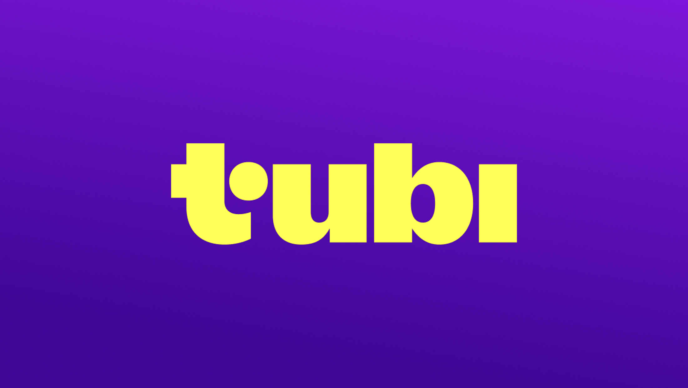
The new logo’s base is centered on the feel of one of the gregarious sans serifs that are seemingly on trend these days — a choice that conjures connections to Antique Olive and others.
Its thick foundation is complemented by thinner, almost pinched points where curves intersect with straight lines, which helps make the design feel a bit more spry and friendly.
Overall, the lettering has a bit of a retro, groovy — or dare we say, tubular — look to it.
If that wasn’t enough to send home just how “tube-y” things are, the right part of the crossbar in the “t” has been replaced with a circle. The “i,” meanwhile, is purposefully lacking a dot.
For a color palette, there’s a fresh violet that’s been dubbed “Turple” alongside “Hello Yellow.”
The violet and yellow color palette has already been drawing comparisons to Amazon’s Freevee look, though its take on yellow is a bit more toward the sickly end of the spectrum and its violet is a deep shade that borders on black.
“During a time of seismic change in entertainment, Tubi continues to grow and resonate with audiences as the most watched free TV and movie streaming service in the U.S. This traction comes from our commitment to putting the viewer first, and we’ll continue to lean into this strength in the coming year with a series of new programming and product initiatives,” said Tubi CEO Anjali Sud in a statement.
In addition to the logo, Fox Corp. also updated Tubi’s sonic identity.
At its core, this consists of a voice saying the two syllables in the brand’s name in a drawn-out fashion: “Tooooooo-beeeeeee” is basically what it sounds like as the sound harmonizes with a musical note.
Just in case that part didn’t convey the name enough, the end of the signature has the voice saying “Tubi” very quickly, almost as if the voice is popping up to say the name again.
The audio, though short, also features a mix of authentic and synthetic musical sounds that have been carefully blended together.
Here again, however, it’s hard not to draw some comparisons to Freevee’s sonic branding that also sounds out the streamer’s name. It uses a rush of sounds that ultimately crescendo together to sound as though someone is speaking the platform’s name.

Accompanying the sonic branding is an animation that is a nod to the idea of a rabbit hole, a theme that Tubi used during Super Bowl LVII in 2023, which aired on Fox.
In true over-the-top Super Bowl ad fashion, the dramatic spot featured giant rabbits grabbing people and quite literally throwing them down the quintessential rabbit hole. Not to fear, however, because it turns out there’s an endless amount of TV to explore. That year also saw Fox “tricking” viewers into thinking the game was being interrupted by an invisible remote as part of another Tubi promotion.
Viewed another way, the logo animation could also be seen as a nod to a black hole or, again, dare we say, a tube-like wormhole that connects two disparate scenes in much the same way Alice’s rabbit hole led to Wonderland.
In the animation, the rabbit hole opening is shown more as a burst of light than as a physical structure and is displayed from a side perspective. A yellow circle playfully flies through the hole and the screen shifts to yellow with purple dot and hole.
The dot then flies back through the hole, where it joins the rest of the logo as part of the “t.”
Meanwhile, Tubi is doubling down on the rabbit hole theme with a new tagline, “See you in there.”

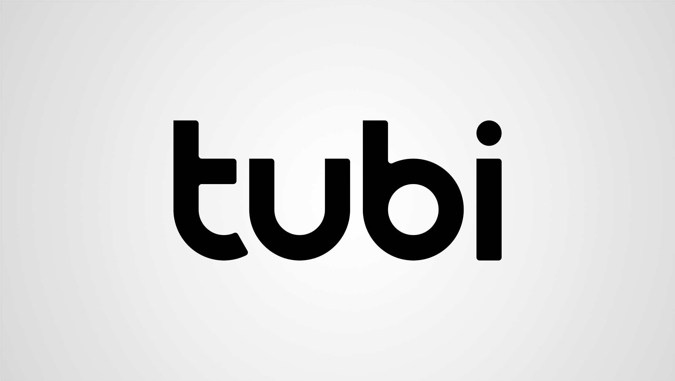
Prior to the redesign, Tubi used a logo created using ultra-round glyphs for its first three letters and a traditional “i” dotted with a circle.
The logo’s distinct “t” and “b,” along with the rounded base of the “u” certainly conveyed the notion of “tubes,” but also felt a bit too much like any number of logos for tech companies and streamers, in particular Philo.
It typically used a blend of red, orange and magenta under the old look.
Tubi’s refresh comes as Fox Corp. looks to expand into the U.K. later in 2024, with a wider European expansion to follow.
Subscribe to NCS for the latest news, project case studies and product announcements in broadcast technology, creative design and engineering delivered to your inbox.


tags
DixonBaxi, Fox, Fox Corporation, Free Ad-Supported Streaming Television (FAST), logo design, Tubi
categories
Branding, Broadcast Design, Broadcast Industry News, Heroes