NBC owned stations’ new graphics let peacock’s true colors shine a bit
Weekly insights on the technology, production and business decisions shaping media and broadcast. No paywall. Independent coverage. Unsubscribe anytime.
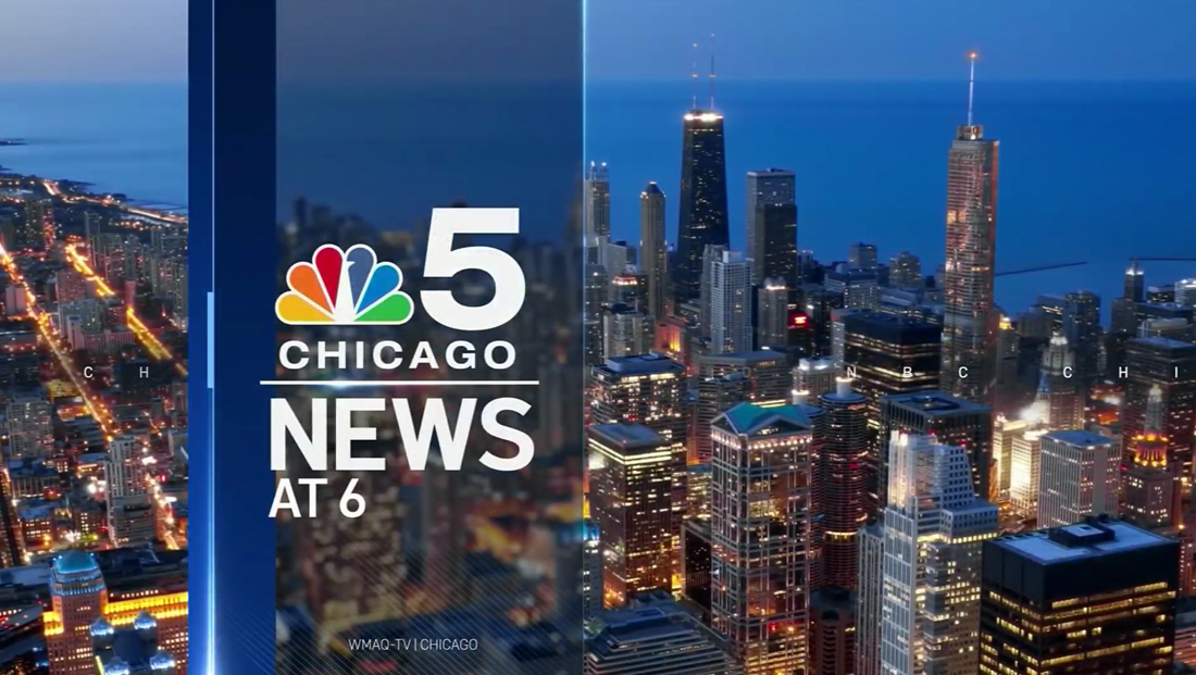
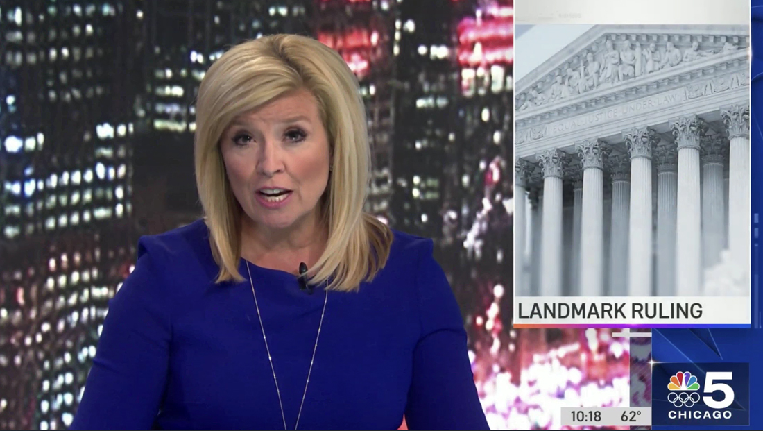
WMAQ in Chicago has become the first NBC station to roll out a new group graphics package that adds splashes of the network’s peacock logo, June 21, 2021.
Dubbed “Look S,” the new graphics package replaces “Look N” which debuted in 2016. Both packages were created by Arthouse, NBC’s in-house creative team based in Fort Worth, Texas.
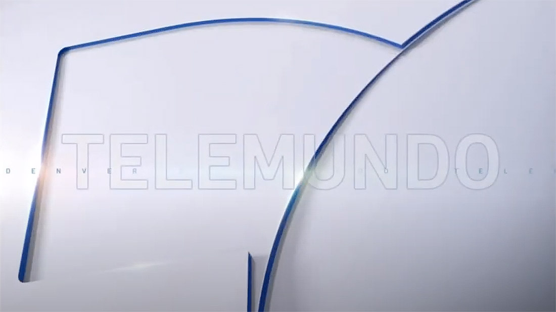
KDEN, the Telemundo affiliate in Denver, rolled out its own variation of the look the previous week.
This marks the first time both NBC Owned Television Stations and Telemundo Station Group have shared a package from Arthouse following a refresh in 2018 that brought Telemundo stations closer to Look N’s design.
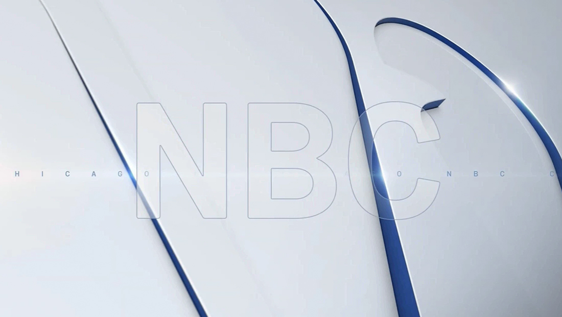
The new design drops some of the trademark elements of the old — namely the nearly always present top banner and lower promo bar. Also gone are the glassy angular shapes, which NBC called “tessellating triangles” at the time, sometimes displayed as a textural element inside of an oversized peacock outline.
Instead, the new package appears to focus more on a traditional version of the peacock icon and its trademark colorful palette — though blue is the most dominant of all the feather colors. The Telemundo version, meanwhile, uses a palette that matches the network’s national newscast with the “T” icon.
The package retains the bespoke font “Arthouse Owned,” which has visual similarities to FF Din, that NBC-owned stations switched to in 2019 by replacing the font in Look N with the new one.
Other prominent elements of the new package include light bursts, a diagonal hash mark background, rectangular border and triangle accents and a blend of microtext and oversized, outlined typography.

For NBC stations, the peacock, in oversized form, makes background appearances on surfaces with the feathers subtly extruded out of it thanks to dark blue and gray borders with a varying degree of depth and animation — with some applications using a deeper blue overlay.
Meanwhile, the full spectrum of feathers appears in a blocky gradient as part of quick animations when lower third banners enter or transition between story headlines and reporter or VSOT interview subjects’ names. Station talent have centered names with social media handles under, while others get left-aligned with an optional second-tier descriptor.
Telemundo lower thirds forgo six color look in favor of just blue in the animation.
Look S notably does not jump fully on the flat design bandwagon — but the design is decidedly less glassy and 3D than its predecessor.
It continues the practice of “squeezing” in OTS and sidebar style graphics — rather than having the camera adjust to leave space on one side — and also still uses a similar animation effect that “shoves” the picture over slightly when an OTS enters.
The new OTS design features an orange to blue gradient along the bottom along with a blue overlay with hash marks, line segment and extruded NBC peacock background.
Lower third banners have switched from a textural blue background to a gray and white gradient with a blue line along the bottom that transitions from an electric blue to a deeper shade as it goes across the screen.
The design scales back the size of the bug box, but it remains in the lower right corner of the screen. It also now animates between a standalone NBC peacock and station logo. In the case of WMAQ, the word “Chicago” has been added under the logo, which now appears in all white rather than the silvery effect on the old look.
To transition between the two states, the peacock either enlarges to fill the entire space or shrinks back to sit next to the “5” and above the Olympic rings, which NBC owned stations are incorporating into their branding ahead of the network’s coverage of the Tokyo games in July, but will presumably feature the normal station logo in non-Olympic periods.
The entire box is framed out with thin lines with a burst of light in the upper left corner, a look that’s similar to the lower third elements on “NBC Nightly News.”
Meanwhile, the time and temp elements are now in a space to the left of the bug box in a gray bar, with the option to add an additional, darker gray bar to the left of this with social media icons. During select newscasts, a ticker can also be placed to the left of the time box.
The placement of the current time and temperature is similar to the way Telemundo stations have been placing this information before the switch.
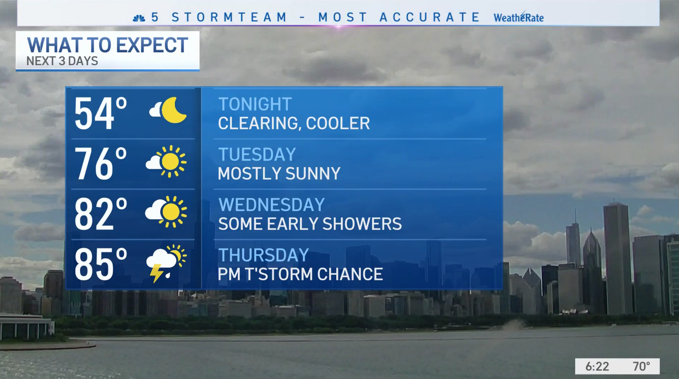
Like with the previous design, the bug typically disappears during weather, but in these cases, the time and temp element slide over to the far corner of the screen. During select portions of weather, WMAQ’s iteration of the new look includes a header touting its “most accurate” rating along the top of the screen, reminiscent of the quasi-permanent one in Look N that would change depending on the segment.
The header also briefly appears at the top of most newscasts featuring the date.
A similar approach is used when footage from Sky 5, the station’s helicopter, is shown.
The weather graphics at many NBC O&Os, including WMAQ, have been quietly updated over the past months to a look that better matches Look S. A few minor updates have been made to the weather look, namely dropping a metallic angled edge on headers.
The bug also serves as a jumping-off point for teasers going to breaks, which typically feature short blurbs of text inside of a box that buts up against the bug topped with a yellow to red gradient accent.
Tease headlines before the newscast opens, however, are left-aligned.

Stations have the option of switching much of the graphics package to red for breaking news or weather, a change that includes that color replacing the blue gradient in lower thirds as well as the blue in opens and tease graphics.
The red open version also shifts the off-whites slightly.
Those opens now feature a large version of the extruded white and blue peacock with the letters NBC appearing in outline form and station branding in generously spaced microtext behind it before the features transition to the horizontal hash mark look before transitioning to a very quick image of the city in black and white.
There’s a quick vertical bar with “News” that sweeps across the screen, turning the image to color while another bar shifts the view to another cityscape before a final one enters and stops about a quarter of the way across the screen, forming a vertical panel for the station logo, which enters the screen via a hash mark pattern, and newscast title and time, that fades in with a slight downward animation.
The blue (or red, in the case of breaking news) bars to the left of the panel feature a light burst as well as a small, thicker line accent that creates a sort of “handle” that’s found attached to other line elements in the package.
Opens remain sans announcer, at least in Chicago, and are followed but a brief blue fullscreen transition with a large iteration of the station logo.
Similar elements are used as transition wipes throughout the newscast with stingers and other quick animations — though these often move in a vertical direction instead of horizontally.
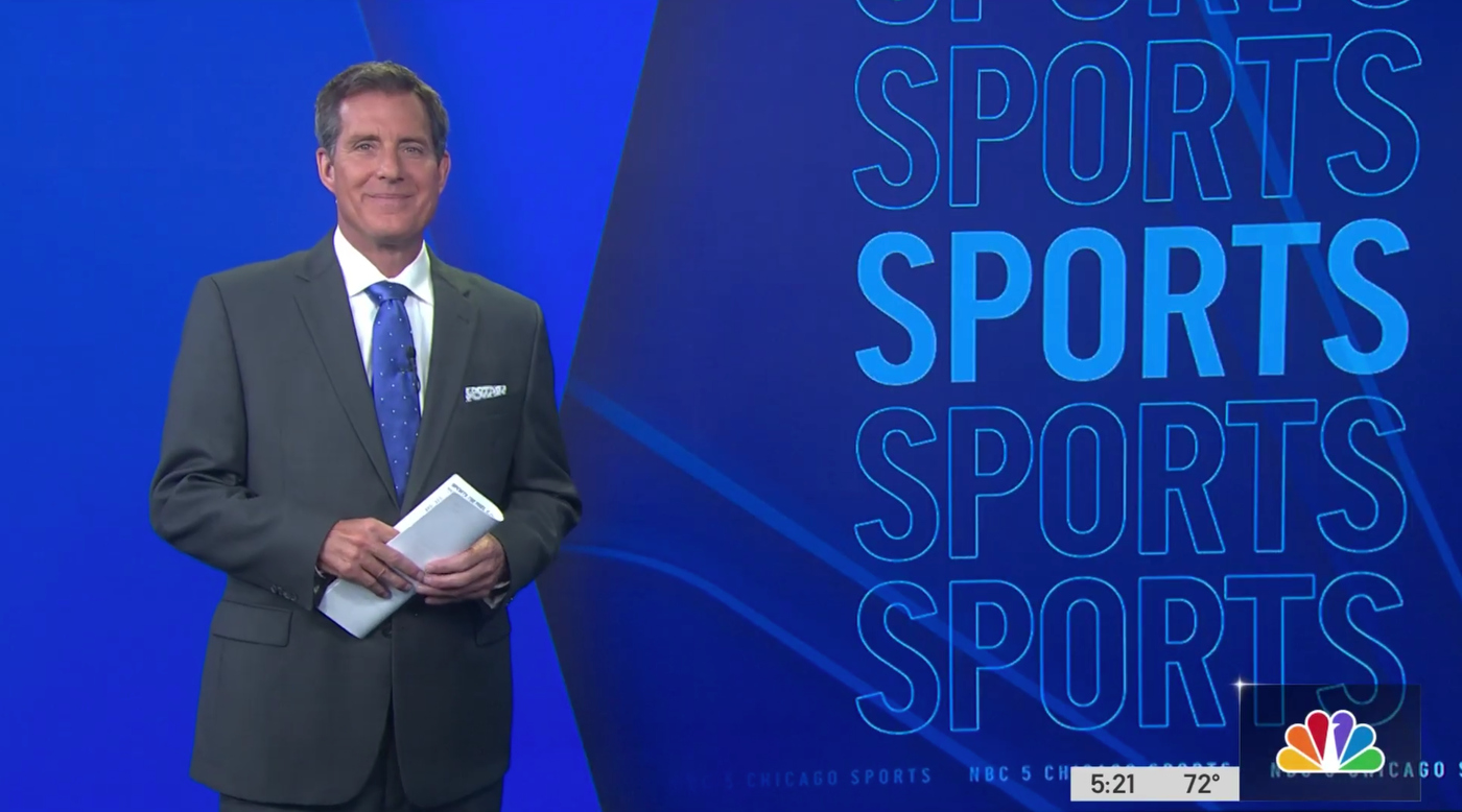
On set graphics have some new options as well — there’s a generic blue background with hash mark and peacock accents that can be showed behind anchors and, similarly, the video wall for sports has a new backdrop with the word “Sports” repeat down one side of the screen and a new stinger.
Many of these designs include a triangular element to the low left of the text box, which is also used as a “bullet” point in on screen graphic lists.
In addition to the graphics updates, WMAQ also updated the music cuts used for opens, with slight variations used for different dayparts, while still using the Stephen Arnold Music package many NBC-owned stations use.
The station has also added an L-shaped video wall installation to complement its already fully stocked arsenal of LED that was added over a period that stretched from 2018 to 2019, but notably did not change the layout of the set, which dates back to 2012.
The video wall area, which was bordered in black, was used for anchor standups and featured topical imagery behind talent, but the station hasn’t quite seemed to figure out how to block these shots, with shots appearing on June 21’s 4 p.m. and June 22, 2021’s 4 a.m. newscasts featuring anchors standing in front of significant portions of the on screen text.
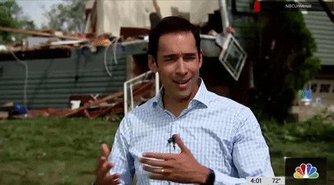
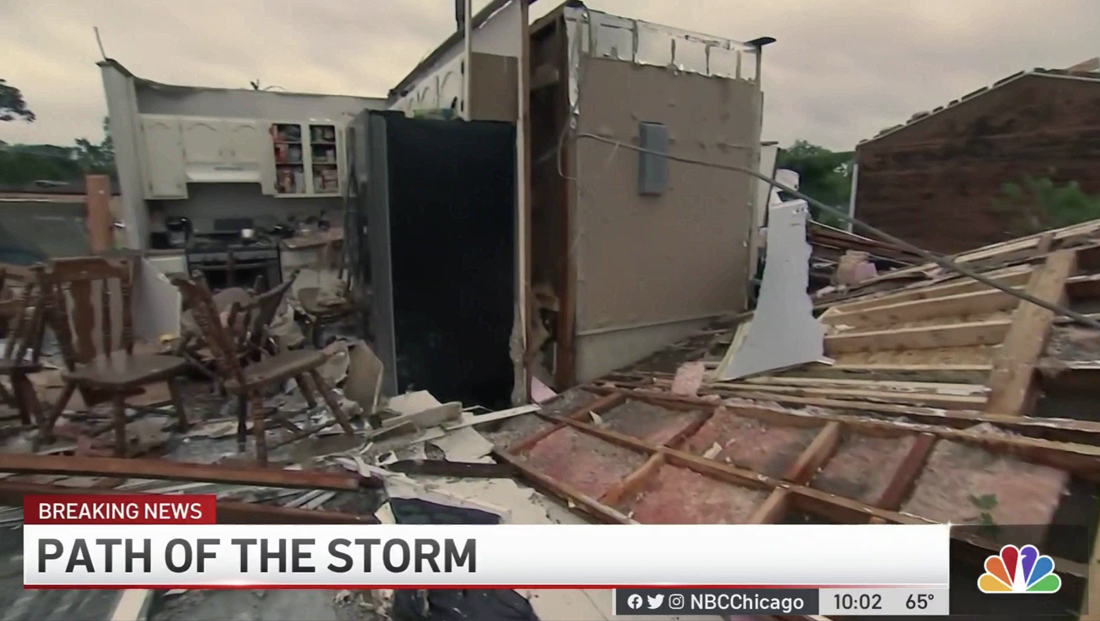
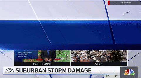
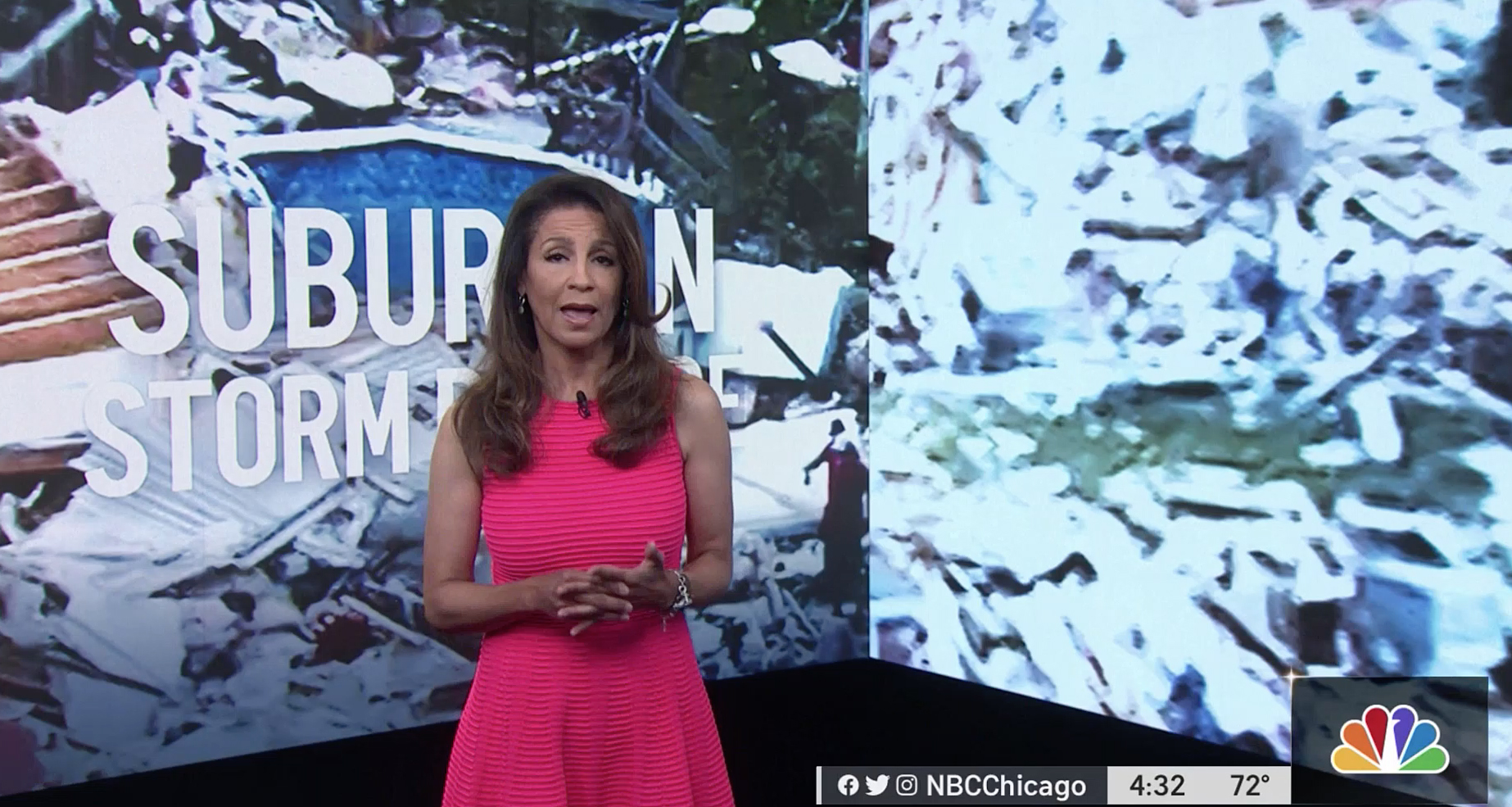
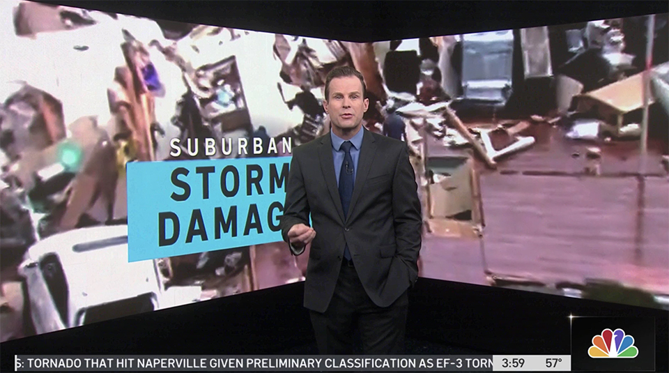
WMAQ debuted Look S on a busy news day — its 4 p.m. and 10 p.m. shows were split anchored between the studio and suburban Chicago for special coverage of severe weather, which lead to several technical glitches and a surprisingly long signal delay given that co-anchor Stefan Holt was just about 30 miles from the station.
Holt’s feed also suffered audio issues and at one point during coverage on June 21, causing the newscast to go completely to black (save the bug) and lost audio before Holt popped back up on screen randomly.
At another point, co-anchor Marion Brooks almost seamlessly stepped in to read power outage stats after Holt’s audio feed was lost.
Correction: An earlier version of this story misidentified anchor Stefan Holt.

tags
Arthouse, Look S, NBC, NBC Arthouse, NBC Owned Television Stations, Telemundo Station Group, WMAQ
categories
Branding, Broadcast Design, Graphics, Heroes, Local News