NBC’s Olympics design blends pictograms, glints of gold
Weekly insights on the technology, production and business decisions shaping media and broadcast. No paywall. Independent coverage. Unsubscribe anytime.
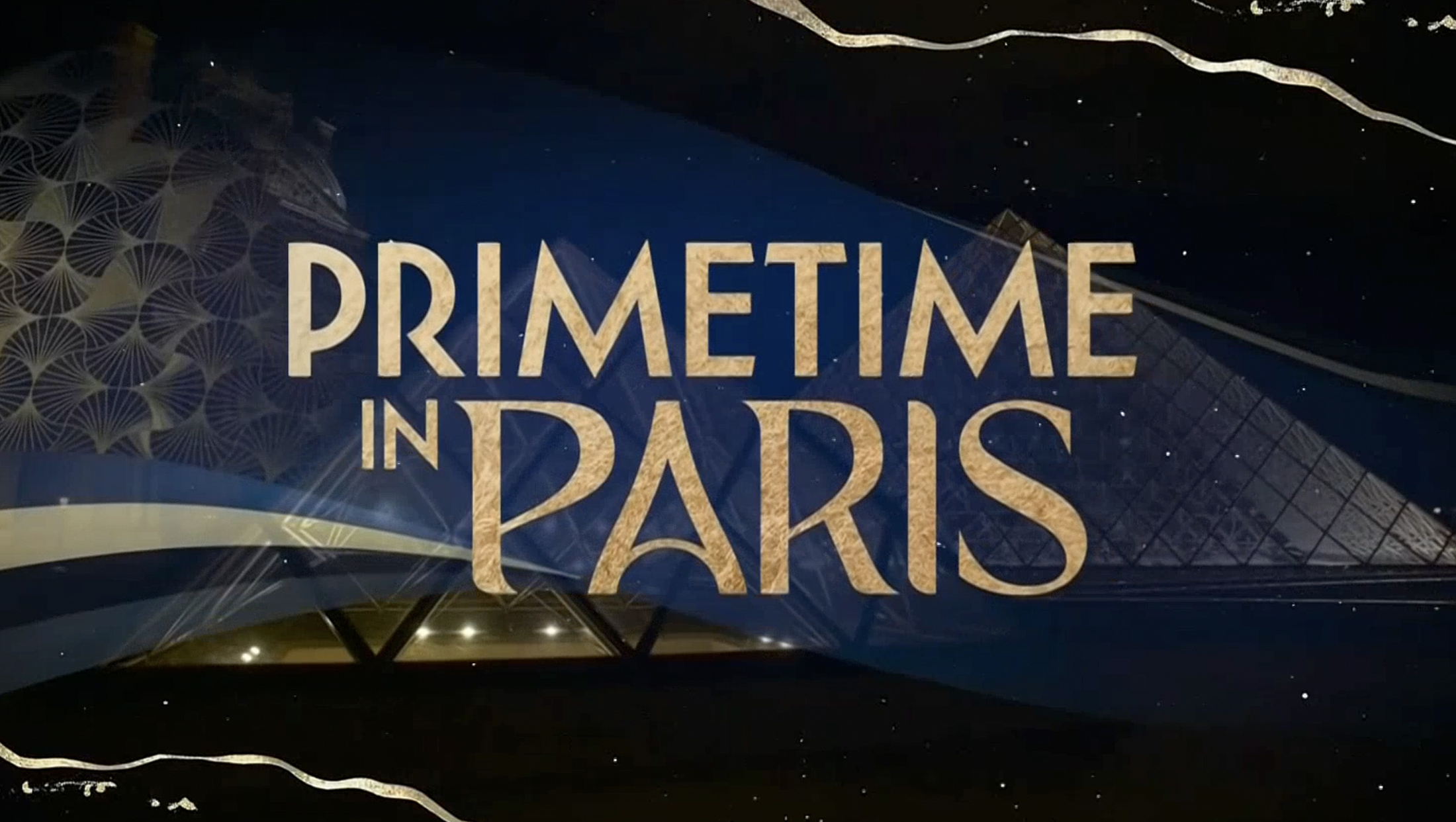
NBC’s graphics for the 2024 Summer Olympics are an elegant blend of fine linear elements, distinct colors and artistic textures.
“One of the goals of NBC’s production of Paris 2024 was to make Paris a major character in the storyline of the games,” David Barton, vice president, creative at NBC Sports Group told NewscastStudio. “Beyond the primary goal of focusing on the athletes and participating countries, the graphics package was formulated to wrap the entire viewing experience in creative details and motifs that celebrate Parisian culture and daily living.”

This included themes of elegance and beauty mixed with light-hearted whimsy and delight throughout the package.
“The design team was inspired to reflect the wonder and magic of Paris through the many details big and small,” added Tripp Dixon, vice president, creative direction of NBC Sports Group.
“The desire of the design team was to create a package that was as diverse as it was controlled,” explained Barton, noting that it would go in many different directions over 17 days and needed to have the flexibility to develop throughout this span while still maintaining a consistent presence.

Before diving into NBC’s look, it’s important to note that 2024, like most other years in recent memory, saw the local Paris organizers release a set of official pictograms representing each event in the games.
This year, instead of focusing on drawings of a figure in action in the event, designers create a set of “coat of arms”-style icons that combine a graphical representation of a distinct “tool of the sport” with a “depiction of the playing field” and an “axis of symmetry.”
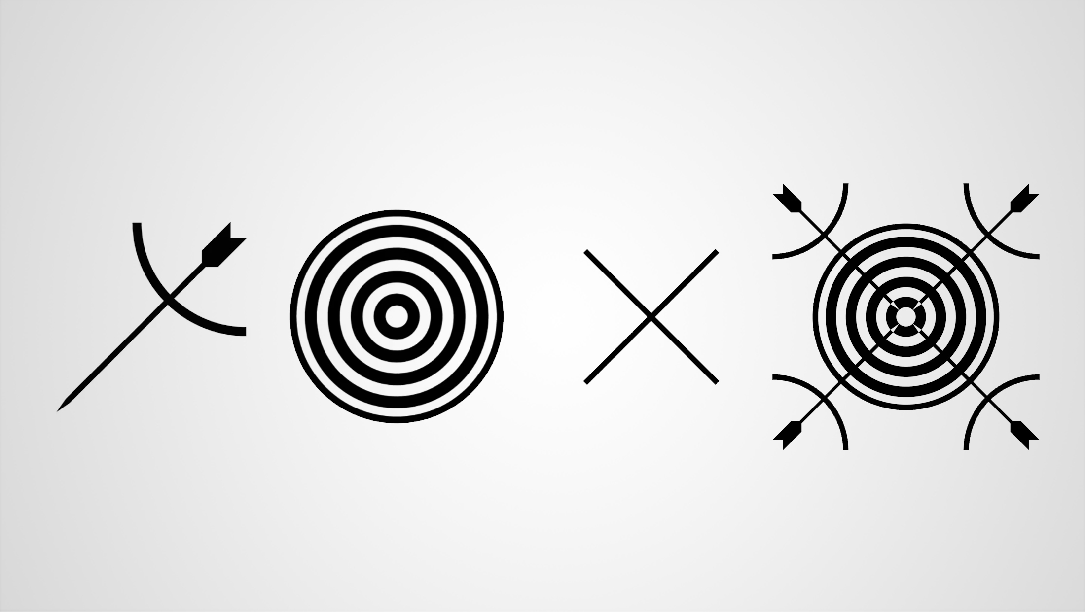

In this example released by Paris 2024 organizers, the bow and arrow on the left represent the ‘depiction of the action.’ The bullseye target, second from left, stands in as a graphical representation of the event’s ‘playing field.’ Those two elements are combined with an X-shaped axis, second from right, to form the final ‘coat of arms’ pictogram for archery, far right.
That means that, instead of the image of a figure poised to release an arrow for archery, the 2024 pictograms show bows and arrows combined with a bullseye target on an X-shaped axis.
This results in 47 designs representing each of the programs included in the 2024 Summer Olympics, all of which have a decidedly different feel from those used by other host cities in the past. Instead of blocky or flowing characters, there are clean lines offset with solid geometric shapes that form the final pictogram imagery.
In many ways, the elegance and geometry of these designs end up speaking to many of the same design inspirations NBC looked at Art Nouveau and the Art Deco movement that followed in the late 1890s to 1930s, after originating in France and spreading across Europe and to the U.S.
Thanks to NBC’s decision to use similar design cues, its 2024 Olympics graphics package ends up blending nearly seamlessly with these pictograms’ concepts and adding its own textures, colors and motion for U.S. audiences.
“The design package has aspects of high end 3D, 2D, period art, traditional paint, mixed media and hand drawn illustrations, but the method in which all of these elements can live cohesively together in a single package is where the uniqueness can hopefully be found,” said Barton.


Program pictograms have historically appeared prominently within networks’ graphics packages for the Olympics, and NBC is no exception this year, but they often feel more like a label applied after-the-fact as opposed to part of the design.
The pictograms seem very much at home within NBC’s Paris look, and it’s worth noting that the pictogram designs were released before the games started.
In addition to serving as small, on-screen visual cues to what events are being discussed, pictograms are also often included in full-screen animated wipes to transition from sport to sport or during roundup segments.


The single and multiple axis symmetry of the pictograms provide NBC with a sold foundation for its animations, often using kaleidoscope-like looks that maintain mirrored images.
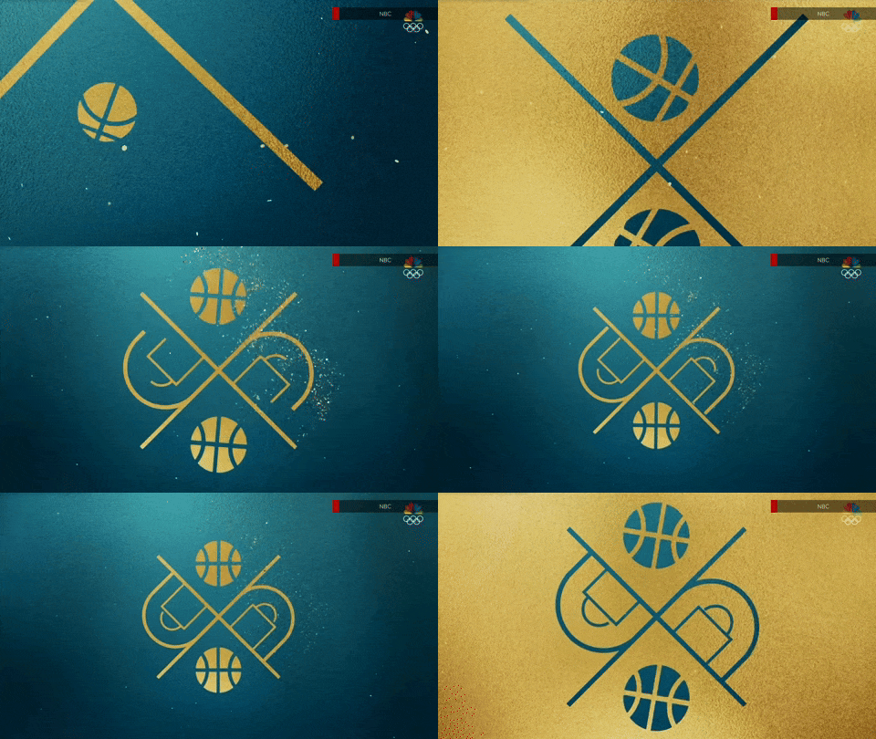


For color, NBC opted to use a base palette of blues, greens and violets. These shades integrate closely with the Olympic Broadcasting Services‘ insert graphics seen on most RHBs around the globe.
These graphics primarily handle live scoring and timing data on screen during competitions.
Green was introduced as a dominant color in OBS’s 2020 update, and the shade also has connections to French color through a pigment known as “Paris Green.”
In some cases, the use of green makes the graphics feel a bit like they should be for tennis or golf coverage, rather than a multitude of events, but that’s overcame by working in those other complementary colors in the blue-violet range.
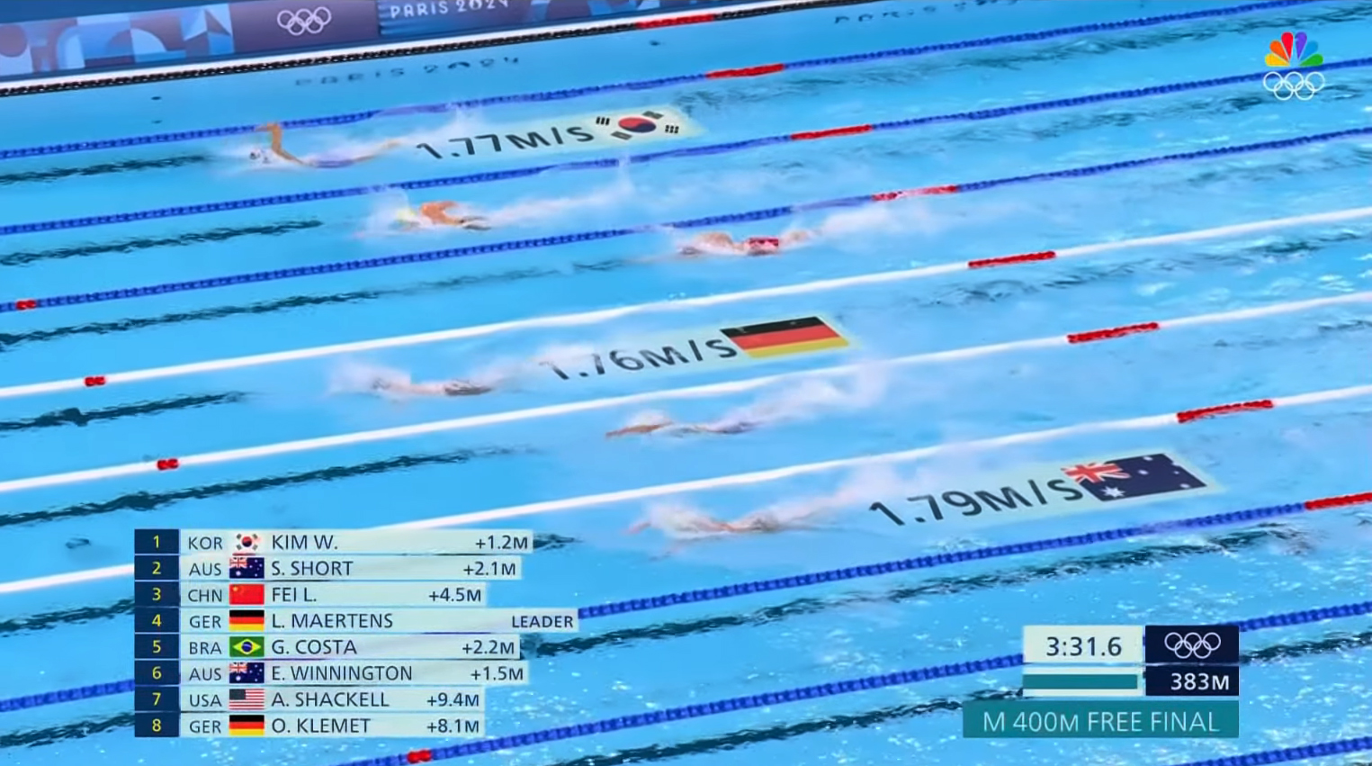

OBS built upon its 2020 green design by shifting the colors slightly to a deeper blue and teal — a palette that, in turn, better matches the oversized geometric patterns used on banners, wall covers and other panels around many of the venues.
“The design team communicates closely with OBS to understand their design goals in the live event coverage,” explained Dixon.
“NBC’s objective is to support all that wraps around competition – from standings pages to country and athlete IDs, to brackets and complete studio show packaging. As partners, NBC tries to create a package that is complementary to the direction of OBS, while maintaining a unique creative approach that feels distinctly NBC,” said Barton.
NBC uses a mix of blue, violet and green backgrounds as base for its look, but other colors often find their way in, including the ability to change background colors to match country flags.
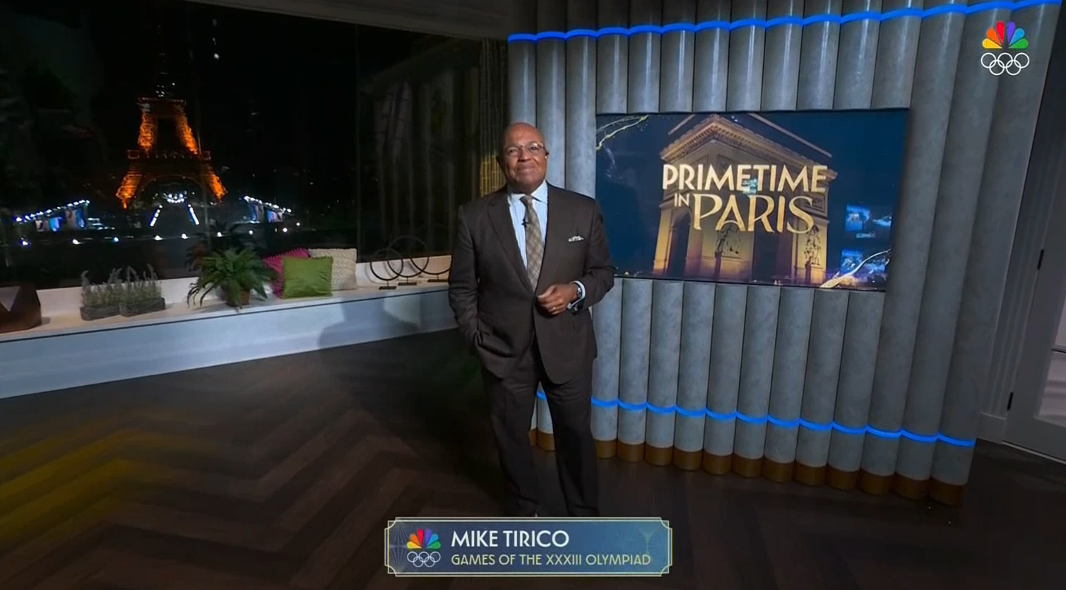

Typically people, including talent and athletes, are identified on-screen with a small centered box featuring a double outline — one of which has squared off corners and the other sporting concave quarter rounds. This double-line look heralds back to the style of the pictograms, while the curves a nod to the Art Nouveau inspiration behind NBC’s Olympics logo.
NBC brings in texture through the use of subtle backgrounds behind many elements, which are often patterns that feel like elegant wallpaper inspired by the same art movement.


Bolder versions of these patterns appear in one of NBC’s many animated wipes, which combines its oversized “Paris” wordmark with curved paths of green and red interspersed with gold edges.
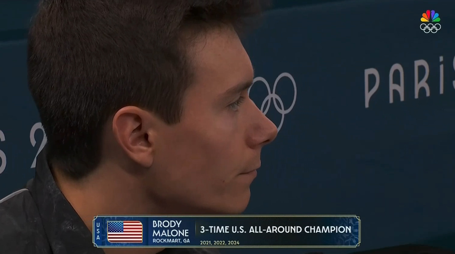

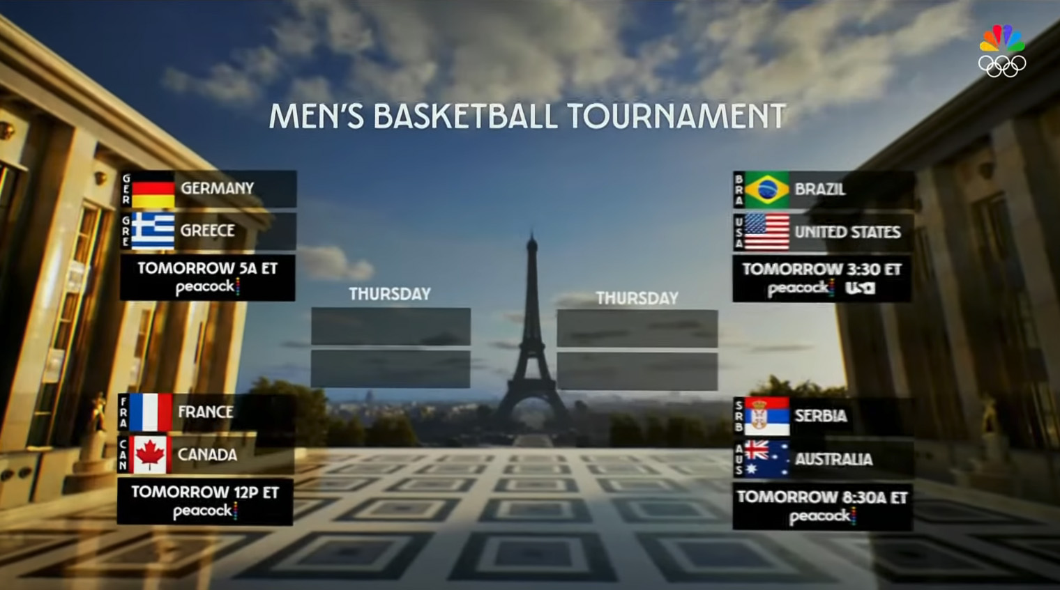
Athletes, meanwhile, can also be identified with wider centered boxes that include the three-character country abbreviation stacked vertically on the far left, the country’s flag, a stacked name with hometown, and a wider space to the right for displaying historical data and other information.
Meanwhile, another way to identify athletes is a team-based approach featuring a full-width bar that enters the bottom of the screen and includes circular portraits of each person.


In this layout, the names and golden flourishes below each athlete are also added. This layout is also used to introduce commentators.
The flag image in these layouts are set inside a thin gold outline with traditional 90-degree angles in the northwest and southeast corners. Things get switched up in the opposite corners, with a gently curved corner appearing in those two.
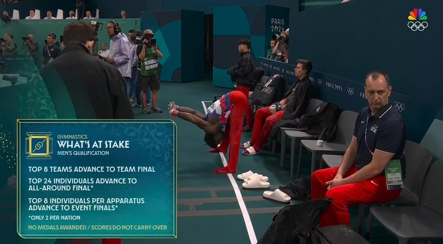

That shape is also used as the foundation for other insert boxes designed to go over footage of events, including “What’s at stake” graphics designed to help viewers understand the path to medals. These boxes can also incorporate a gold version of the sport’s pictogram.
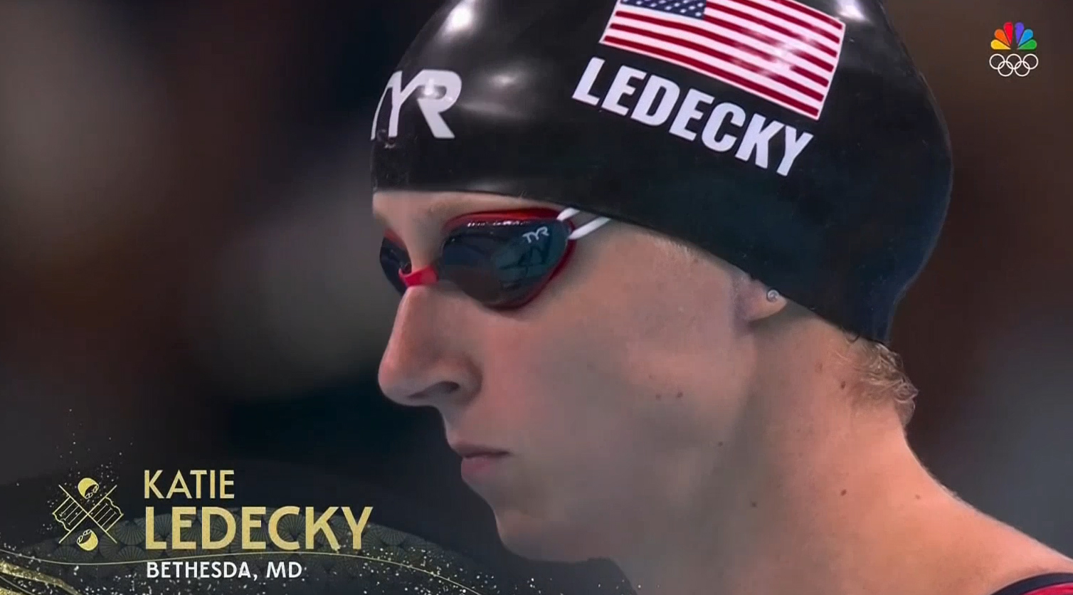

Speaking of gold, it’s no surprise that shade is a key part of the graphics package — a sort of symbolic nod to so many athletes’ ultimate goal.
The shade can appear in a variety of formats — sparkly textures in shapes and letters, gentle curved elements reminiscent of filigree, paths of gold “dust,” shimmering sequins or in the color cast on city imagery.
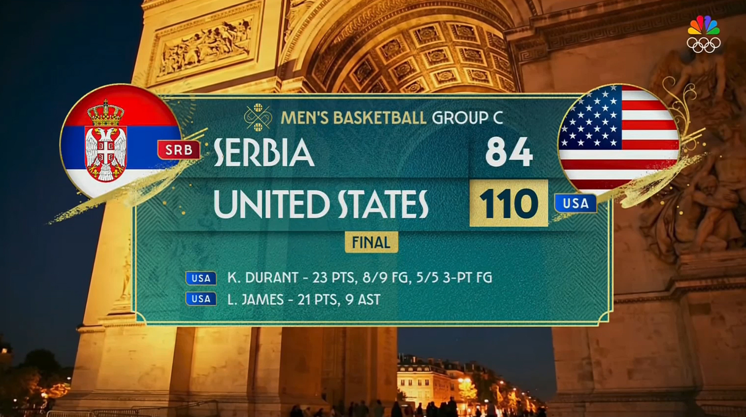

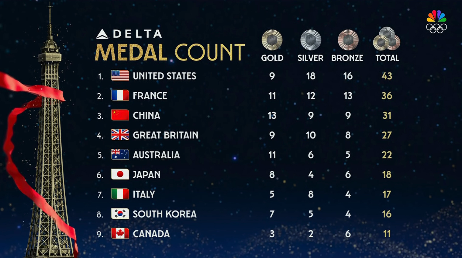
A gold brushstroke can be found in the fullscreen score graphics, breaking out of the rest of the look’s more reserved, boxed look.
These strokes add a flair of energy under each country’s flag, housed in circles. Each flag emblem also has a subtle graphical element behind it that’s easy to miss but continues the nod to nouveau and French design in general.


The use of brushstrokes continues in the look for “Today in Paris,” a roundup-style segment that summarizes events not featured in NBC’s primetime broadcasts.
A short animated open blends bright gold with subtler greens and blues along with cutouts of athletes and oversized typography.
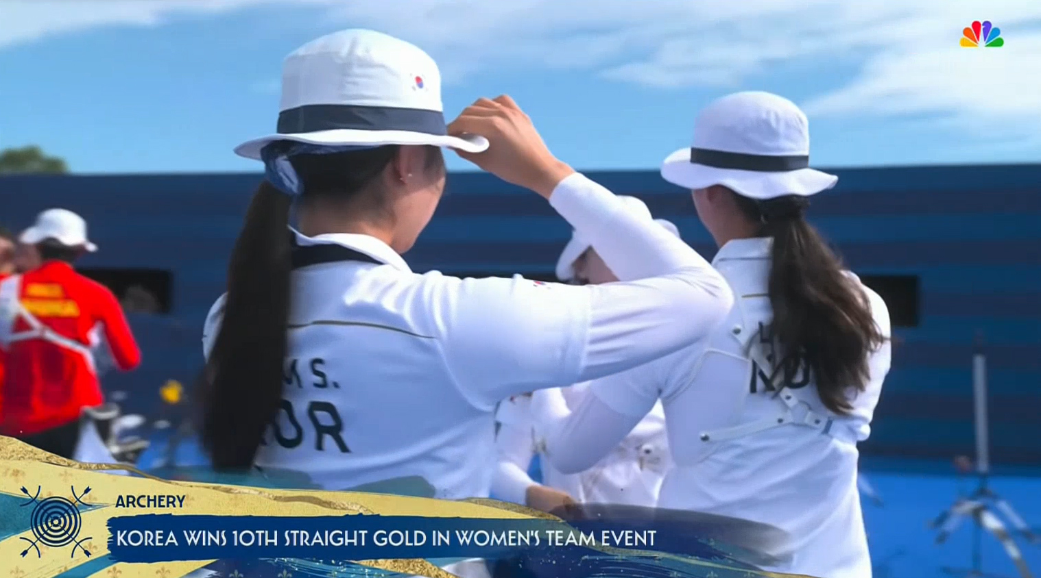

The lower third inserts used during this segment feature a masterfully messy amalgamation of brush strokes.


For select events, such as street skateboarding, NBC can also use a more colorful, free-flowing design that combines video clips with textured animated accents denoting the action. The connection to the other looks is carried through thanks to consistent typography and the oversized repeating animated text that can have hints of gold.
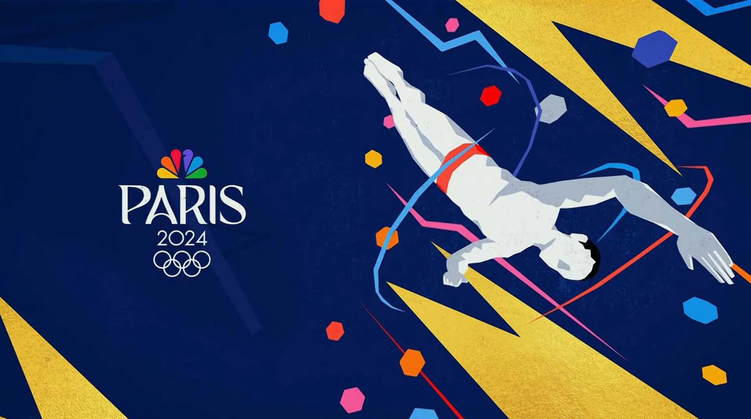

Midway between the more casual look and the brushstrokes is the use of flowing elements that are still more restrained than the brushstrokes.


These can include fine gold paths that quickly fill up with a flowing graphic, often accented with repeating patterns or intricate swirl accents. In many cases, the on-screen element can also exit the screen in much the same way it entered.
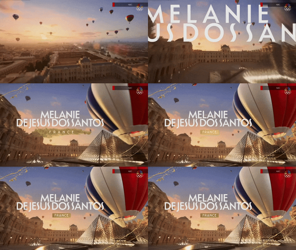
Outside of insert graphics, there are several notable fullscreen looks, including one that starts with a golden-hour view of Paris (or at least a 3D model of the City of Lights) with hot air balloons hovering in the sky.
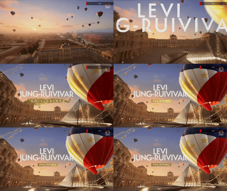

The viewport quickly pulls back and lowers toward the ground of the Louvre courtyard, which features the famous (or infamous) glass pyramid designed by I.M. Pei. Sitting just in front of the structure is another hot air balloon bearing the colors of the athlete’s country.


These animations also include the athlete’s name and country spelled out and include the ability for the text to gently tuck behind the balloon if it can and remain legible.

NBC also uses 3D Google Maps-powered views of the City of Paris to showcase venue locations.


These feature thin gold renditions of the pictograms sprouting into the sky like keys as the viewport spins around to focus on the venue in question, with additional information such as capacity and events held at the same location appearing on screen.
In addition to fullscreens and inserts, NBC has also deployed augmented reality elements.


In one use, these are also used to help identify venues and showcase athletes, with the event name in large text inside of a boxed element inspired by the insert graphics that floats over the venue’s main area.


There are multiple animations that can accompany these, including a longer version with large gold sequins that form a virtual trail through the air to the primary element. A shorter option uses a trail of gold dust that looks like the haphazard path of an insect flying through the air.
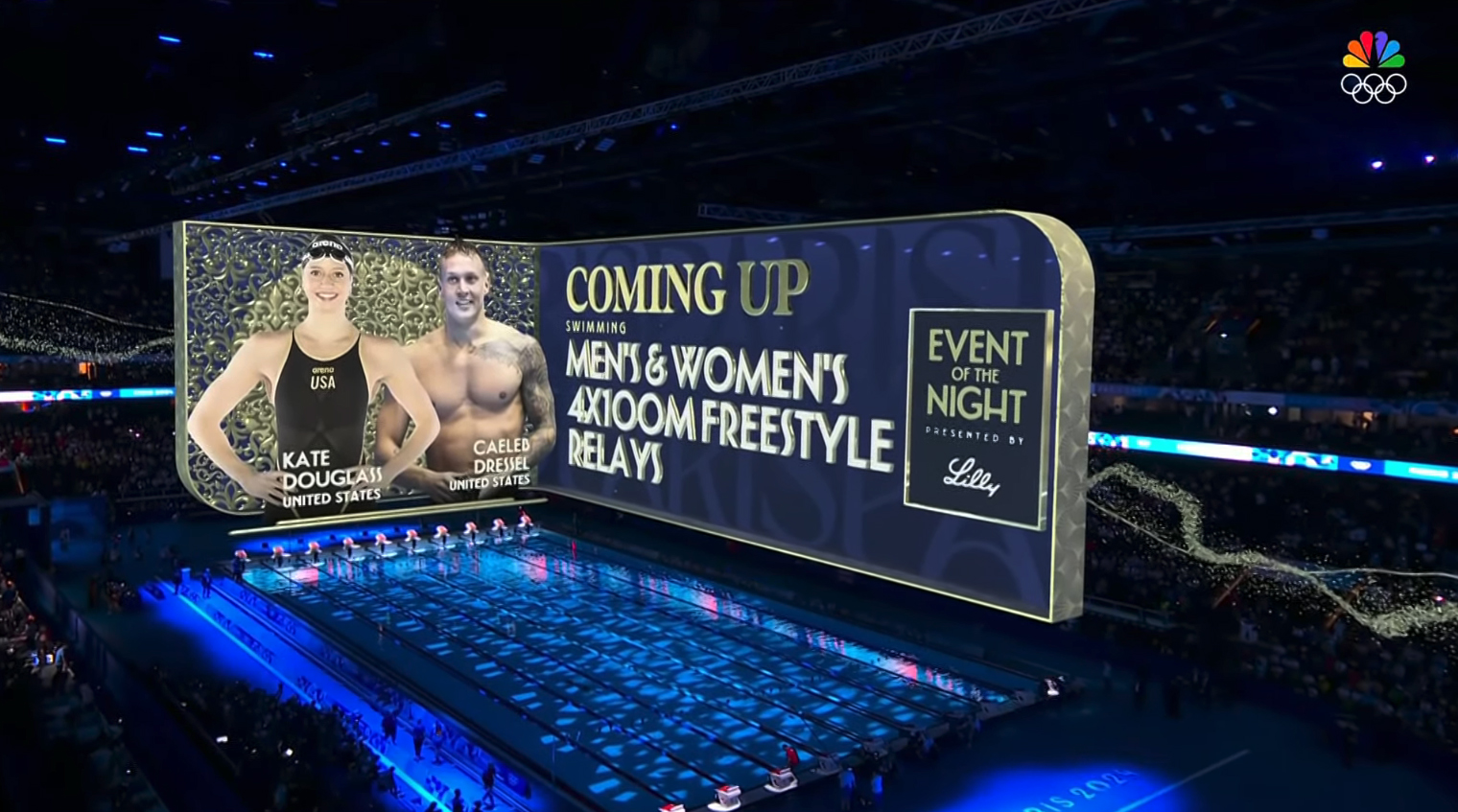

NBC also makes use of on-set video walls and panels to add additional visual elements to its coverage.
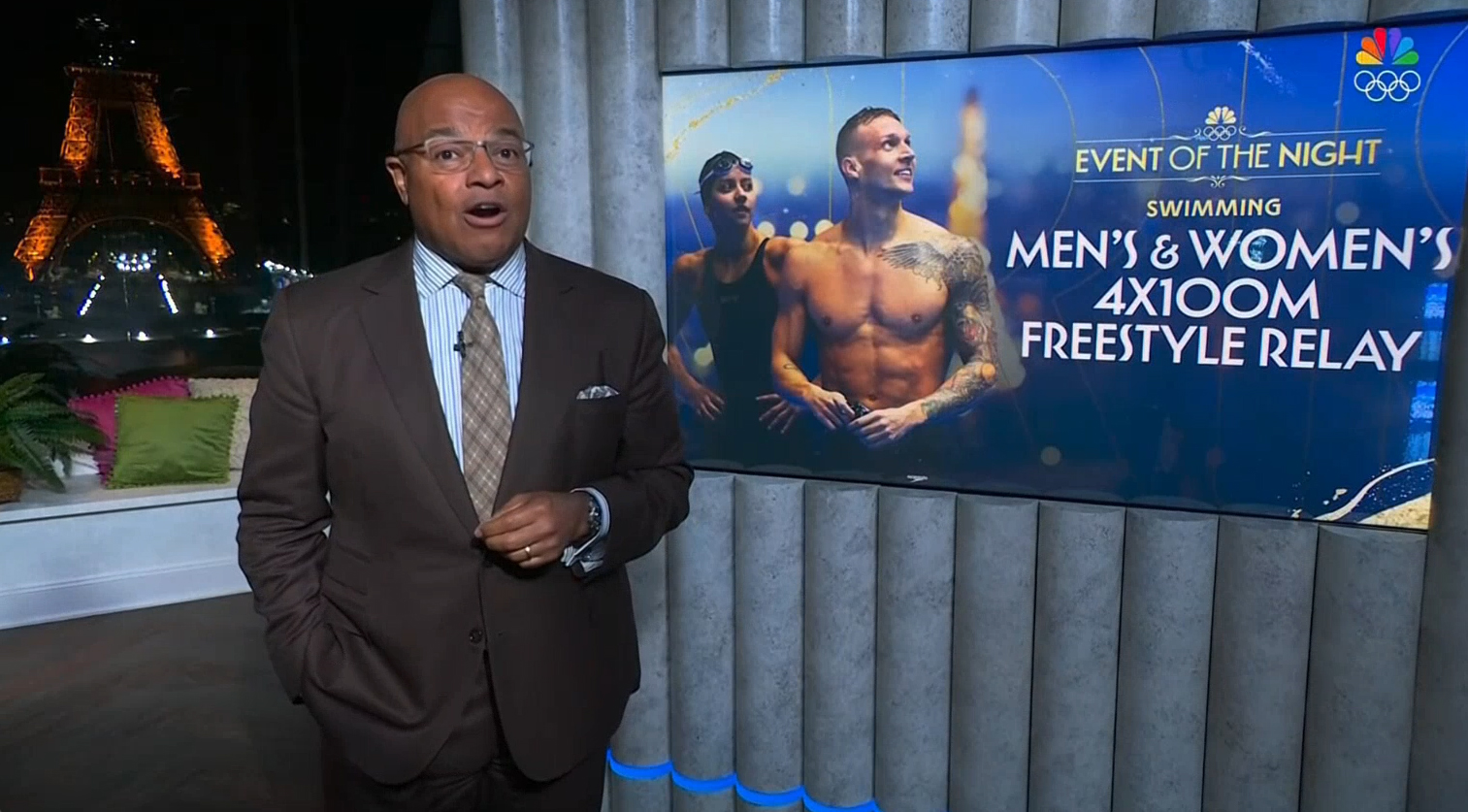

This can include images shown on smaller panels with branding or topical graphics as each event or athlete is mentioned.
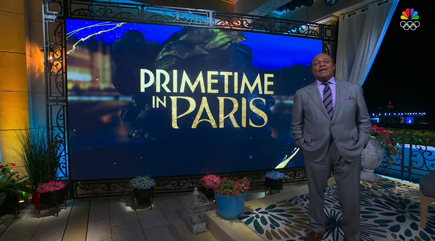

In addition, video walls can also feature athlete- or event-specific imagery, typically using a blend of typography, photography and background elements.
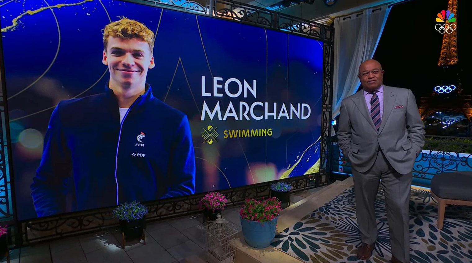

Many of the on-set background elements use a blue-violet shade in the background, with gold-outlined typography and textures added for good measure — along with a trusty pictogram.
Besides the pictograms, another unifying element of the NBC 2024 look is the use of distinct typography.


To complement the distinct “Paris” wordmark released previously, NBC uses two typefaces in most of its on-screen text.
“The typographic strategy needed to be the ‘creative glue’ to connect all the various themes together,” said Dixon.
“The fonts in the package have details that are direct references to Parisian Art Deco and Art Nouveau. As an information system, the fonts needed to be readable and clear, while creatively showing purpose and distinct character,” added Barton.
Both have a geometric, Art Nouveau-inspired feel, but one, as shown in the “Coming up” tag above, has pointier tips and corners along with bold straight angles (ironically, the font feels a bit like the “classic” NBC logotype set in Futura before the network switched to NBC Tinker) while the other, which appears in gold above, features more graceful curves and subtly rounded off corners.
Some have noted the font used for “Coming up” in this example appears to be similar to Marseille from Louise Fili, but some key modifications have been made.
In many ways the typeface shown in white in the example above is a nod to the stricter axial symmetry of the pictograms, while the softer look feels a bit more casual, dynamic and even playful, which ties into the more illustrative elements of the emblems.





tags
2024 Summer Olympics, david barton, NBC Olympics, nbc sports, Tripp Dixon
categories
Broadcast Design, Graphics, Heroes, Olympics