‘Today’ gets new graphics with dynamic angular elements
Weekly insights on the technology, production and business decisions shaping media and broadcast. Free to access. Independent coverage. Unsubscribe anytime.
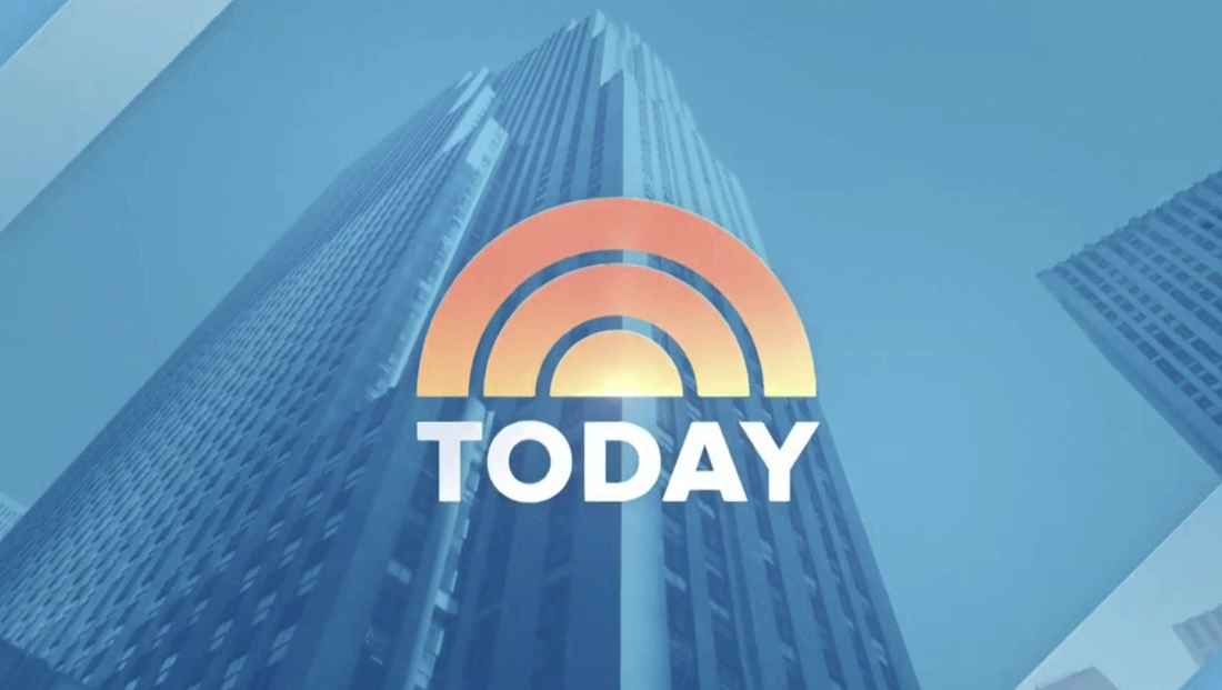
As NewscastStudio first and exclusively reported, NBC News‘ “Today” debuted an updated graphics package Monday, May 3, 2021.
The updates include a new main open, fullscreens, lower third banners, bug, on-set graphics and wipes that largely incorporate new angled elements instead of horizontal bars and curves.
The network’s previous look was centered around ring-like elements inspired by its sunrise logo, but that had slowly been reduced as the show evolved designs and started using more horizontal bars and rules.
In January 2019, the network rolled out new insert graphics and other elements that mixed the circular elements with horizontal bars in a variety of heights and rectangular “containers” for lower thirds that could grow in width to accommodate whatever text was in them.
Just a few months later, rival morning show “Good Morning America” introduced a new look that used rectangles and concentric rings that lead to some NBC insiders NewscastStudio spoke with noting similarities between the show’s looks.
With the new 2021 look, the show’s tease headlines start with text in the middle of the screen, like before, but with a bit more elegance, with the “Today” logo as part of a blue overlay behind it. There’s also a triangular “arrow” accent used in the lower right of the initial larger headline as well as angled “overlay” effects.
“Today” appears to have largely stuck in the same family as its previous blue hue, smartly keeping it well away from the slightly brighter and bolder looks used on “Good Morning America.” Some lighter, friendlier shades have also been added.

The centered headline text then jumps to the lower left of the screen in a blue element.
The upper left and lower right have a translucent angled effect, with the latter playing host to the show logo. Similar elements are used on “coming up” graphics as well as the two, three, four and more box layouts that showcase views of multiple hosts and guests at one time.
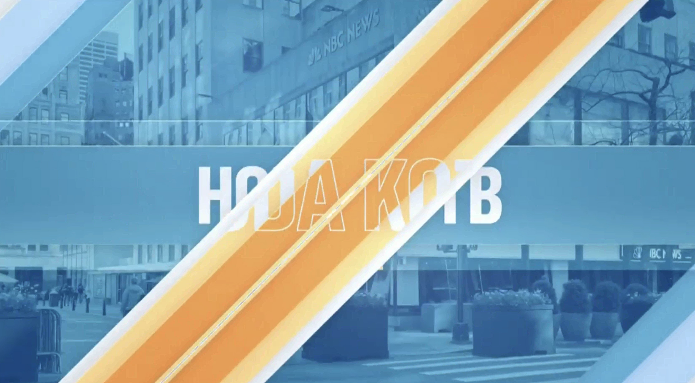
Co-anchor Hoda Kotb’s name is revealed with angled elements and imagery of Rockefeller Center in the background.
Diagonal wipes, as well as diverging angular elements, serve as a way to reveal various elements, including co-anchors Savannah Guthrie and Hoda Kotb’s name in the completely revamped open design.
The music and announce remains almost identical, but “swoosh” sound effects have been added timed to animations.
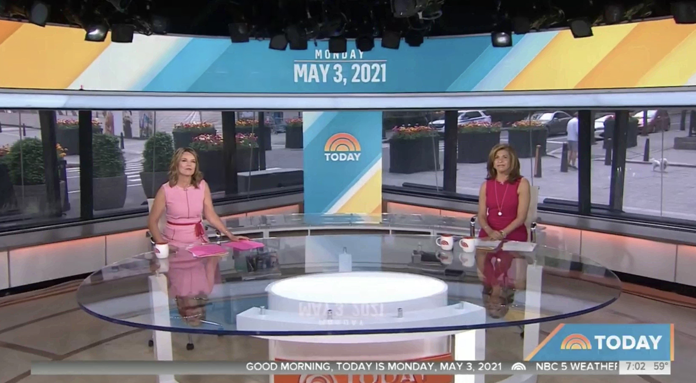
Home base, with its larger socially distanced anchor desk, also now features the new look on its LED video panels.
At the top of the show, the two-shot at home base showcases matching angular elements on the LED header and vertical elements.
The bug box, which was previously square and fit precisely above the space the network reserves for local affiliates to insert the current local time and temp, has become wider and now uses the “Today” logo lockup that puts the sunrise side by side with the typography, which has the result of the show name become much more visible.
The logo, which rotates between the NBC Olympics logo (and presumably will switch to the standard NBC News logo once the games are done) has a downward sloping angle on the left side, though this is most prominent when there’s no banner to the left.
When those banners do appear, they blend into the bug space, making it appear as a single, cohesive bar with angled elements inside.
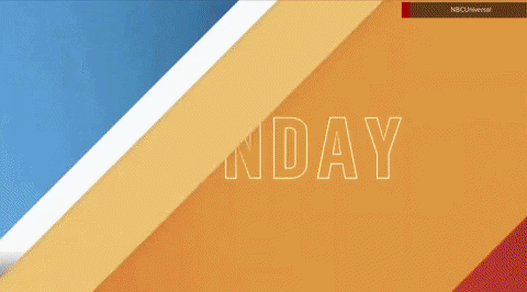
The angled elements are animated, moving slowly from side to side in the background and also serving as a transitional element, with a parallax effect used to switch between story banners and identifiers as well as when rotating between talent social media handles and locators, as shown in the GIF above.
Banners also get orange-yellow gradient caps on either side that extend slightly past the ticker and time and temp and are similar in color and thickness to the angled line used to define the left angle of the space devoted to the bug.
The font in the chyron banners has been switched from Proxima to Flama Condensed, sources have confirmed, which gives the show an opportunity for higher character counts (Flama is also what NBC used in its Decision 2020 graphics).
While angled elements often work well in fullscreen and background graphics, they can sometimes pose issues when used with lower thirds, since the angled part essentially becomes unusable in terms of being able to fit any typography there, leaving odd empty space.

“CBS This Morning” tried a few versions of angled graphics in the past, but hasn’t used them in a few years.
“Today” smartly didn’t make the angled element be the actual “container” for most elements — especially lower thirds — but rather a background and transitional element that text could be on top of and interact with rather than have to fit around.
The angles also have an interesting tie-in to the curves in the sunrise — albeit ones that are straight rather than curved — but when to consider what the sunrise might look like in oversized applications, it’s not that far of a stretch to see the visual tie ins.
The red breaking news look with the bug area changing color as well is shown above. When transitioning from a story that requires a different color, there are angled eye-catching animations that take care of the changeover. There’s also the option for a third tier above with an angled end.
In addition, the show can use the lower left corner to show franchise bugs instead of just the standard logos, something that’s a big easier to do now that there’s a wider amount of space.
The angular corner elements pop up again in teases when the co-anchors preview what’s coming up — and here the banners do get an angled “end” — but since these looks aren’t quite as text heavy and also align with the lower corner, they work a bit better.
The new lower third banners are not quite as high as the old ones — and NBC appears to have opted to keep the namedropper ticker area and time and temp bug X/Y coordinates the same, as shown in this comparison GIF from Friday, April 30, 2021 and May 3.
In some past redesigns, affiliates were advised in advance that they need to update the exact sizing and positioning of these elements, which are typically added at a local or regional master control hub and not by NBC the network.
NBC’s feed includes the gray backgrounds for both components and for station’s who don’t opt not to insert the namedropper or time and temp (or suffer a technical glitch that prevents it from happening), the boxes just appear, rather awkwardly, empty (they also typically appear this way on streaming repeats).
For the show’s 8 a.m. open, a mix of the old and new look are used, with the new angled motif appearing most in animated wipes. while the boxy and glassy look of the on-screen headlines remains.
Another update that doesn’t appear to have rolled out fully is the weather background used on the video wall the network kept after 2020 election coverage, moving it to mostly cover the Orange Room.
Meanwhile, the 9 a.m. hour, which is a separate show known as “Today 3rd Hour” or the “Third Hour of Today,” uses a much bluer version of the open. Its previous open also used blue.
The show previously used a plum shade in its lower thirds that were similar to the first two hours’ that was unique but also reportedly felt a bit too dark for a morning show.
Lower thirds are a slightly darker shade of blue that the 7 and 8 a.m hours. This part of the show also does not use the ticker or time and temp bug, so the banners are a bit lower on screen but the same height.
In many ways, the new “Today” look also brings, whether by design or not, some additional consistency between the looks used on NBCUniversal networks and programming, including the recent MSNBC redesign that also blends its lower thirds with its bug box and can change color as well, as the rectangular L3 banners on “NBC Nightly News” and the network’s standard special report insert graphics as well as the branding bars NBC often runs along the bottom of the screen for special reports.
Other than updating what images are shown on the on-set video walls, “Today” didn’t introduce any significant set updates — the lighted “sunrise” sculpture still sits camera left of the 40-foot curved video wall in Studio 1A and the sliding door with backlit curved elements is still on the opposite side.
In many ways, this demonstrates the flexibility of video walls in studios — a new graphics update typically doesn’t require much, if any hard scenic changes.

tags
NBC, NBC News, Today
categories
Branding, Broadcast Design, Broadcast Industry News, Graphics, Heroes, Network Morning Shows