
CBS deconstructs its ‘eye’ for updated branding strategy

Weekly insights on the technology, production and business decisions shaping media and broadcast. Free to access. Independent coverage. Unsubscribe anytime.
Note: This story is from 2020. For information about the new local TV station graphics and rebranding, read this 2023 article.
CBS has introduced a new network broadcast branding strategy that breaks down the “parts” of its iconic eye logo and reimagines them as a bold series of shapes, animations and graphical elements.
The new look is replacing the package introduced in 2018 from studio Sibling Rivalry, which relied heavily on more muted colors and a condensed iteration of the letters “CBS.”
The design drops that typeface in favor of TT Norms, similar to what is used in the ViacomCBS logo introduced in late 2019.
However, the look’s core focuses on the CBS eye icon across all branding elements in “a flexible style that elevates it as a standalone logo and leans into the shapes and elements that make it up – separating and rejoining in unity via lively animation,” according to a statement from the network.
That’s sort of a fancy way of saying that the elements of the CBS eye have become the base for the new branding animations and compositions.
Those shapes include the large circle footprint suggested by the logo as well as the two concentric rings in a thin outline style derived from the larger circle and the one that forms the shape of what would be the “whites” in the eye.
While those shapes are fairly straightforward, a more unusual shape is the football shape with a circle inset created by taking out that “white” and what would be the iris or pupil of the eye.


The new identity, created with agency Gretel, also expands upon all of these shapes and forms and creates multiple other takes by intersecting and animating them in various combinations — including many creative uses of negative space.
Promos typically start with a clean, simple, centered CBS eye in a matching color palette for the show being featured before diving into the meat of the spot.

At the end of network promos, there is typically a quick animated sequence that’s a take on the “deconstructed” logo coming together to form the familiar eye icon before sliding over to make way for the logotype.
Many of these sequences also add “Live + On Demand + Streaming” along the bottom, an obvious reference to the multiplatform approach CBS is taking, like so many other broadcasters.
Just like the opening scene, the colors and styling vary based on the show. Examples are embedded throughout this story and as a single playlist at the end.
The rebranding also includes aural elements — including the verbal reading of the line “This is CBS,” a holdover from the network’s early days as a radio-only broadcaster.
Also new is a five-note mnemonic or musical signature, that’s meant to suggest the “This is CBS” line.
CBS also has its eyes on making all of its various divisions come together under the same brand look.
Programs are being labeled as either “CBS Originals” (a way to describe its traditional entertainment programming that appears to borrow language from streamers’ use of the word “originals”) “CBS News, “CBS Sports” or “CBS Presents.”
The “Presents” label is reserved for special telecasts, such as “CBS Presents The 56th Academy of Country Music Awards.”
CBS News promos that started airing in mid-October also switched over to the new look at the end, with the added use of a slowly rolling circular footer with room for video above.

Also featured is a grayish, oversized semi-3D rendition of the CBS eye with the inner circle used a “frame” for talent and other imagery.
It’s worth noting that hints of the new branding can be found in existing graphics packages for shows such as “CBS Evening News” and “CBS This Morning” — notably the use of outlined versions of the CBS eye and typography.
It’s not immediately clear if the elements used in October will be used as a permanent branding element for news division productions, but it has shown up in both in multiple versions of “CBS Evening News” and vice presidential debate promos in the days surrounding the announcement.
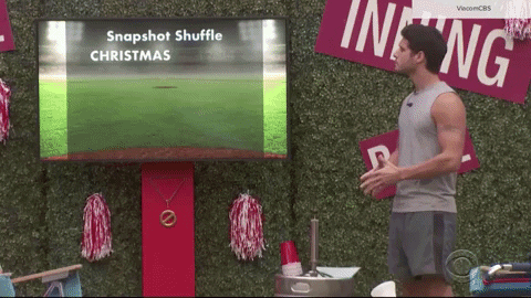
Meanwhile, CBS Sports has been airing promos and snipes that feature a slightly different take on the idea of using portions of the CBS eye, though it is not immediately clear if this is the permanent look CBS is rolling out.
This look is mainly red, white and blue and also features some dimensional and semitransparent elements.
These spots, which began showing up in the fall of 2020, use a slightly different twist on the primary branding — borrowing distinctive elements from what would be an oversized CBS eye to create metallic “frames” and uniquely shaped spaces for text and other elements along with linear, numerical and arrow micro accents.
New York based agency Antfood provided new sonic logos for the CBS divisions.
CBS Sports spots also typically include a final screen proclaiming it as the home of the Super Bowl LV in early 2021.
The updated typography matches well with the existing, boxy CBS Sports and sport specific logos from back in 2015, which are still widely in use today.
CBS News’ logo appears, at least on the ViacomCBS website listing of its “global brands” switched over to TT Norms, dropping the longtime serif Didot that gave the logo a more distinguish, elegant look. In fact, Didot only remains on the logos for CBS Television Stations (and the related CBSN networks) and CBS Television Distribution arms of the company.

Of course, these looks could be slated for a redo in the coming weeks or months.
In addition to these changes, new branding elements are expected to roll out at CBS’s owned stations, according to the network. Here again, some changes that have been introduced appear to have at least some suggestion of the new network look — namely the use of outlined letters and cleaner typography, though it’s possible these will change more or completely as well.
Most CBS owned stations are still using the white, blue and gold concentric ring motif in opens as well as the blue lower thirds that feature an oversized version of the eye as a sort of background, textural element.

In addition to the new visual and audio elements, CBS also renamed its CBS Television Studios unit to simply CBS Studios to reflect the multiplatform content it has begun to produce.
The network plans to roll out updated looks for the production vanity cards for programs produced by this division.

tags
Antfood, Branding, CBS, CBS Eye, CBS News, CBS Sports, CBS Studios, gretel, logo design, TT Norms, ViacomCBS
categories
Branding, Broadcast Design, Broadcast Industry News, Heroes, Network Branding